Articles & News
Articles & News
Articles & News
Insights, work approaches, ideas. Read it all.
Insights, work approaches, ideas. Read it all.
Get inspired: Read all about our creative journey.
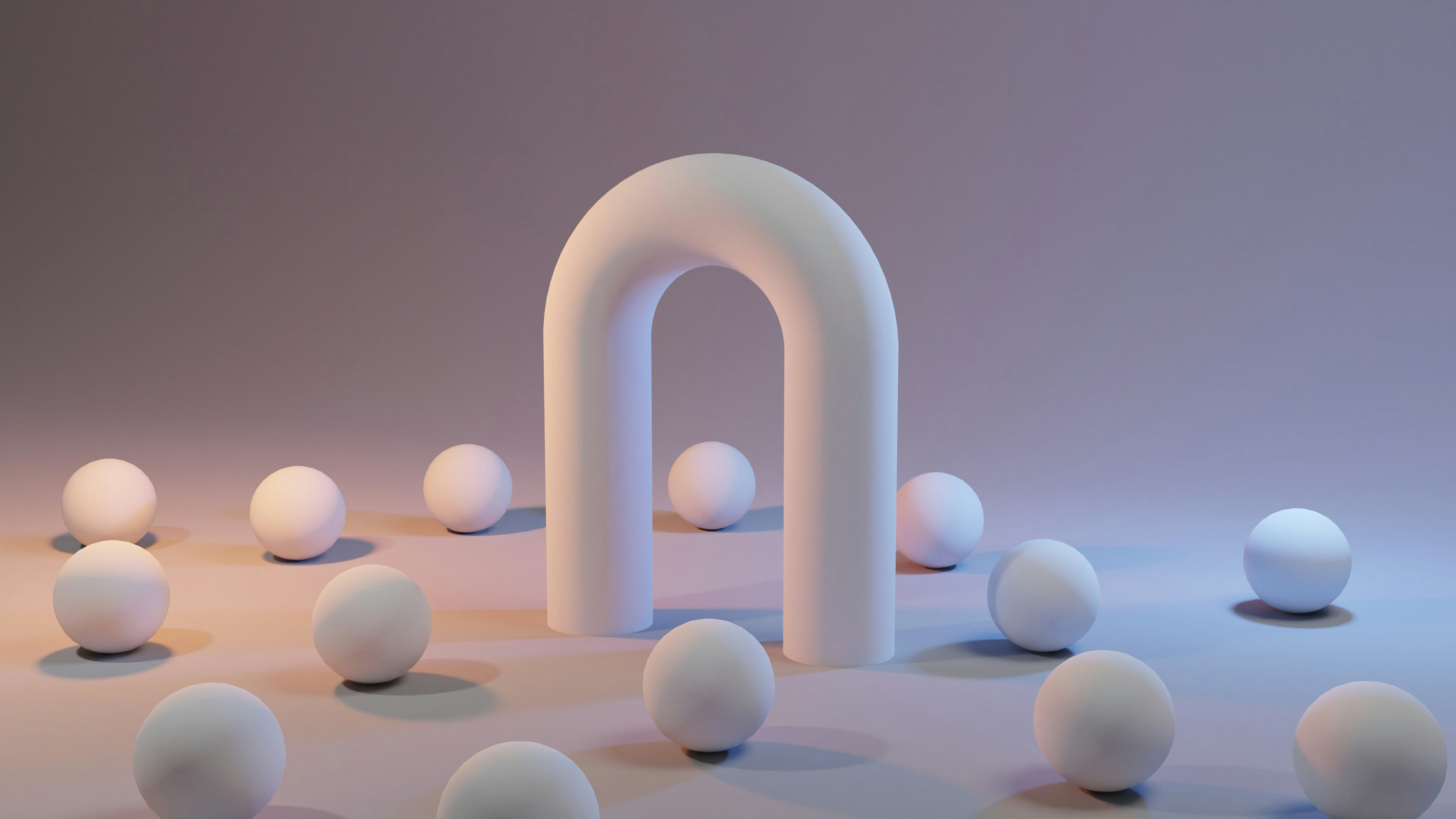
In a crowded digital landscape, immersive 3D design is emerging as the next big thing in UI/UX. This trend moves beyond flat interfaces by incorporating three-dimensional visuals and interactive elements directly into websites and apps. The result is a richer user experience that captivates visitors. In fact, websites featuring 3D interactive elements have seen user engagement jump by as much as 45%. For startups and businesses, riding this 3D wave can mean a more memorable online presence and a stronger brand impression. This post explores what immersive 3D UX design is, why it matters for modern brands, and how leveraging it (with the help of a skilled web design agency) can set your business apart.
What Is Immersive 3D UX and Why It Matters
Immersive 3D UX design refers to using three-dimensional graphics and interactive features in user interfaces to create a feeling of depth and realism. Instead of static 2D pages, users can engage with dynamic objects, scenes, or even augmented reality elements. This approach is more than just eye candy – it’s a strategic move to boost user engagement and satisfaction. Studies show that interactive content holds attention significantly longer than static content; for example, one report found websites with interactive features get 50% more engagement on average. Users today crave experiences, not just information, and 3D UX delivers exactly that. By bringing UI/UX design to life with motion and depth, businesses can communicate their value in a more engaging way and leave a lasting impression on potential customers. This is why many forward-thinking companies and agencies are investing in 3D and immersive design – it’s becoming a key driver of user engagement and brand differentiation.
Benefits of 3D Design for Startups and Brands
Embracing 3D elements in your web or app design can offer several tangible benefits for startups and growing brands:
Higher User Engagement: A well-implemented 3D interface invites users to explore and interact. Whether it’s spinning a 3D model or navigating a virtual space, people tend to stay longer on sites that encourage interaction, reducing bounce rates. As noted earlier, interactive 3D content significantly boosts engagement metrics which often correlates with better conversion rates and repeat visits.
Improved Conversion & Sales: When users can engage with products in 3D (zooming, rotating, customizing), they gain confidence in what they’re buying. For example, Audi’s pilot of a 3D car configurator saw user engagement increase by 66%, along with higher customer satisfaction. Such immersive product experiences can lead to more informed purchases and fewer returns, directly impacting your bottom line.
Memorable Branding: 3D visuals add a “wow” factor that sets a brand apart. Startups can appear more innovative by incorporating modern 3D graphics or animations into their branding. This memorability translates to better brand recall – users are more likely to remember an interactive 3D experience than a flat, static page. A lifelike 3D mascot or an animated logo, for instance, can become a signature element of your brand identity.
Enhanced User Experience: Done right, 3D elements can actually improve UX by presenting information in intuitive ways. Imagine an app that visualizes data in 3D charts or a website with a 3D map for navigation – these can make complex information easier to digest. The key is that a skilled UI/UX designer will ensure the 3D features are smooth and don’t hinder usability. When balance is achieved, users get both beauty and usability, leading to a satisfying experience that encourages loyalty.
Real-World Applications of 3D in Web and App Design
Immersive design isn’t just a theory – it’s already happening in various forms. Here are some practical applications of 3D and interactive UX that startups and businesses can leverage:
Product Visualization and 360° Views: E-commerce websites and apps use 3D models to let users rotate and inspect products as if they were physically in their hands. For example, furniture retailers enable AR previews of how a couch looks in your living room, and shoe brands let you view sneakers from every angle. These interactive product viewers increase user confidence and can lead to higher conversion rates.
Interactive Storytelling: Websites are increasingly using scroll-triggered 3D animations and scenes to tell a story as the user navigates. A tech startup might show a 3D journey of data moving securely through a network to illustrate its cybersecurity product, engaging the user through visuals. This form of narrative-driven design keeps visitors engaged and conveys information in a compelling way.
Augmented Reality (AR) Features: With smartphones and AR kits, apps can blend digital and physical worlds. A mobile app design agency might build features like virtual try-ons (e.g., seeing how a watch looks on your wrist via your phone camera) or interactive AR games tied to a brand. Such features provide novelty and utility, often encouraging users to share the experience on social media – free marketing for the brand.
3D Branding Elements: Brands are beginning to incorporate 3D into their very identity – think of logos or mascots rendered in 3D, or unique 3D illustrations on a website. A company specializing in 3D design can create a mascot that users can interact with on the site (for example, clicking it might trigger a short animation or greeting). These touches make the brand feel modern and tech-savvy, aligning with the expectations of today’s users. Importantly, these elements also create an emotional connection – users enjoy a bit of playfulness and are more likely to remember the brand.
Each of these applications shows how versatile 3D UX can be. Whether your startup is in retail, tech, education, or any sector, there’s likely a relevant way to use immersive design to enhance your product or service. The key is to focus on value-added experiences – use 3D where it genuinely improves understanding, engagement, or enjoyment, rather than as a gimmick.
Implementing Immersive UX: Do’s and Don’ts
While 3D and interactive designs are exciting, successful implementation requires careful planning. Here are some tips and cautions for rolling out 3D UX features:
Do ensure usability comes first: 3D elements should support your content, not distract from it. Navigation and core actions (like clicking “Buy Now” or filling a form) must remain easy. For instance, if you add a 3D background animation, make sure it doesn’t slow down the page or obscure important text. Usability testing is crucial – have real users try the new design and adjust based on feedback.
Do optimize for performance: Rich media can be heavy. Large 3D files or complex scripts might cause slow load times, which frustrate users (remember, 84% of users expect a site to load in 3 seconds or less work with developers to compress 3D assets and use techniques like lazy loading so that your site/app remains fast and smooth. A fast site not only pleases users but also ranks better in search engines.
Do maintain accessibility: Not everyone will interact with 3D content in the same way. Provide alternatives or fallbacks for those on older devices or with disabilities. For example, include alt text or 2D snapshots for 3D models, and ensure that essential information isn’t only conveyed through a fancy animation. Inclusivity in design broadens your audience and is often rewarded in SEO rankings as well (search engines favor sites that cater to all users).
Don’t overdo it: Just because you can animate every element in 3D doesn’t mean you should. Too much movement or complexity can overwhelm users. Aim for a balance – perhaps an interactive 3D hero section at the top of your page, then a clean, traditional layout for the rest of the content. Pick the most impactful spots for 3D so it wows the user without exhausting them.
Don’t neglect mobile experience: Immersive design should be tested on mobile devices thoroughly. Mobile users have less processing power and different navigation (swipes, pinches). Ensure your 3D features degrade gracefully on smaller screens or offer a slightly simplified experience. An experienced app design agency will pay attention to mobile-optimization so that the cool 3D feature doesn’t turn into a mobile usability nightmare.
By following these guidelines, startups can leverage cutting-edge design while still delivering a seamless UX. Often, partnering with professionals is the easiest way to get this right from the start.
Why Partner with a Web/App Design Agency for 3D UX
Implementing immersive 3D design often requires a mix of specialized skills – from 3D modeling and rendering to front-end development and UX testing. This is where hiring the right experts becomes crucial. Here’s why collaborating with a web design agency or app design agency experienced in 3D UX can be a game-changer:
Holistic Skill Set: An established web design agency brings together UI/UX designers, 3D artists, and developers under one roof. This means your project gets looked at from all angles – visual appeal, user experience, technical feasibility – ensuring the 3D elements integrate smoothly with your overall site or app. Startups often lack some of these skills in-house, so an agency fills those gaps.
Faster Execution: With experience comes efficiency. Agencies that have done interactive projects will have workflows and libraries to create 3D experiences faster and more reliably. Instead of your team spending months figuring out WebGL or AR frameworks, the agency can deploy a solution in a fraction of the time, getting you to market sooner.
Strategic Insight: A good agency won’t just be a pair of hands to code a 3D model; they’ll act as a strategic partner. They can advise on where an immersive element will have the most impact, or which idea might not be worth the effort. For example, they might suggest a 3D product tour on your homepage (if analytics show users dropping off early), or recommend an interactive demo in your app to boost onboarding engagement. Their broad experience across clients and industries can guide you to make the best use of 3D for your audience.
Quality and Consistency: When you hire an app designer or agency with 3D expertise, you’re paying for quality assurance. They will test the feature across different devices, ensure branding consistency (colors, style of 3D elements match your brand), and fine-tune details like camera angles or lighting in the 3D scenes to be just right. This level of polish is hard to achieve if you’re experimenting for the first time on your own. Remember, a glitchy or half-baked immersive feature can hurt your credibility, so it’s worth doing it right.
Ongoing Support and Improvement: Technology evolves quickly. A web design agency can not only build the first version of your immersive experience but also help maintain it. As new browser capabilities or design trends emerge, they can update your 3D content to keep it fresh. It’s a long-term partnership to keep your startup on the cutting edge of UX.
In short, while small DIY 3D additions (like embedding a pre-made model) are possible, truly harnessing immersive UX for business impact is a team effort. By collaborating with professionals, startups ensure that their investment in 3D design actually translates to a better user experience and business results, rather than a risky experiment.
Conclusion
The future of digital design is interactive, engaging, and three-dimensional. We’re moving into an era where users don’t just view websites and apps – they experience them. For startups and businesses aiming to stand out, immersive 3D UX offers a powerful way to differentiate your product, tell your story, and connect with customers on a new level. Adopting this trend early can give you a competitive edge: not only will your site or app captivate users, but it will also signal that your brand is innovative and forward-thinking.
However, success with 3D design comes from thoughtful implementation. It’s about enhancing UX, not just adding flash. By understanding the benefits and best practices discussed above, and potentially partnering with a capable UI/UX design agency, you can implement 3D features that truly elevate your brand. As nearly 48% of ecommerce sites now feature 3D graphics, it’s clear this trend is quickly becoming mainstream. The question is, will your business ride this wave or get left behind? Embrace immersive design and give your users an experience they won’t forget – your SEO metrics, engagement rates, and customers will thank you for it.
Tools we build with




Got a project in mind?
Tell us what you’re building. We’ll reply by email with honest next steps, even if we’re not the right fit.
Contact
Designed and built by SideFixers. © 2026 SideFixers.
Tools we build with
Got a project in mind?
Tell us what you’re building. We’ll reply by email with honest next steps, even if we’re not the right fit.
Contact
Designed and built by SideFixers. © 2026 SideFixers.
Tools we build with
Got a project in mind?
Tell us what you’re building. We’ll reply by email with honest next steps, even if we’re not the right fit.
Contact
Designed and built by SideFixers. © 2026 SideFixers.
Topics
ALL TOPICS
BUSINESS
DESIGN
DEVELOPMENT
BRANDING
RESEARCH
Branding
/
Vraj Patel
In today’s world, sustainability is more than just a trend—it's a movement that's reshaping industries and consumer behavior alike. As environmental awareness continues to grow, companies are increasingly seeking ways to align their brand identities with eco-friendly values. This shift has given rise to "green branding," where businesses design their brand identities to reflect a commitment to sustainability. But how can companies create a brand that truly resonates with eco-conscious consumers? Let’s dive into the essentials of green branding and explore how to design an eco-friendly brand identity that stands out.
Understanding Green Branding
Green branding is the practice of creating a brand identity that emphasizes sustainability, ethical practices, and environmental responsibility. It goes beyond using green colors or nature-inspired imagery—it's about integrating sustainability into the core values and operations of a company. Green branding communicates a company’s commitment to the planet, making it a key differentiator in a market where consumers are increasingly looking for brands that align with their values.
Key Elements of Eco-Friendly Brand Identities
1. Visual Identity
The visual aspects of a brand, including the logo, color palette, and packaging, play a significant role in conveying eco-friendliness. Colors like green, earthy tones, and natural textures can evoke a sense of nature and sustainability. However, it’s crucial to ensure that these elements are more than just superficial. For instance, using sustainable materials for packaging or creating a logo that symbolizes environmental consciousness can reinforce a brand’s green commitment.
2. Brand Messaging
Authenticity is at the heart of green branding. Consumers are quick to spot greenwashing—where a company falsely claims to be environmentally friendly—so it’s important that brand messaging is transparent and genuine. Brands should communicate their sustainability initiatives, ethical sourcing, and environmental impact in a clear and honest way. This can be done through storytelling, where the brand shares its journey towards becoming more sustainable, highlighting both achievements and challenges.
3. Sustainability Certifications and Symbols
Incorporating recognized sustainability certifications into the brand identity adds credibility. Certifications like Fair Trade, USDA Organic, or Carbon Neutral signal to consumers that the brand’s eco-friendly claims are backed by third-party verification. These symbols can be prominently featured on packaging, in marketing materials, and on the brand’s website to build trust and reinforce the company’s commitment to sustainability.
Case Studies: Brands Doing Green Right
Let’s look at a few brands that have successfully embraced green branding:
Patagonia: Known for its commitment to environmental activism, Patagonia’s brand identity is deeply rooted in sustainability. From using recycled materials in their products to pledging 1% of sales to environmental causes, Patagonia has built a brand that not only promotes sustainability but actively engages in it.
Seventh Generation: This household product company has made sustainability its core mission. Their branding focuses on transparency, from the ingredients in their products to their commitment to plant-based and biodegradable materials. The company’s name itself is a nod to the Iroquois philosophy of considering the impact of decisions on the next seven generations.
Challenges in Green Branding
Green branding isn’t without its challenges. One of the most significant risks is greenwashing, where a brand exaggerates or fabricates its environmental efforts. This can lead to a loss of consumer trust and can be difficult to recover from. Additionally, sourcing sustainable materials can be more costly and logistically complex, which can pose challenges for companies looking to scale their eco-friendly efforts.
Steps to Create an Eco-Friendly Brand Identity
1. Conduct a Sustainability Audit
Start by evaluating your company’s current environmental impact. Identify areas where you can improve, whether it's reducing waste, sourcing sustainable materials, or improving energy efficiency.
2. Engage Stakeholders
Involve employees, customers, and suppliers in your green branding efforts. Their insights and support can help ensure that your sustainability initiatives are authentic and impactful.
3. Design with Sustainability in Mind
When developing your brand’s visual identity, consider the environmental impact of your design choices. Use recycled materials for packaging, opt for eco-friendly inks, and explore ways to minimize waste in your production process.
The Future of Green Branding
As technology advances, new opportunities for green branding are emerging. For example, blockchain technology can be used to enhance supply chain transparency, allowing consumers to trace the journey of a product from raw materials to finished goods. Additionally, as more consumers prioritize sustainability, we can expect to see a continued shift towards brands that not only talk the talk but walk the walk when it comes to environmental responsibility.
Conclusion
Green branding is more than just a marketing strategy—it’s a commitment to creating a better future for the planet. By designing eco-friendly brand identities, companies can connect with consumers on a deeper level, building trust and loyalty. As the demand for sustainable products continues to rise, now is the perfect time for brands to embrace green branding and make a meaningful impact on the world.

Development
/
Vraj Patel
In today's fast-paced digital world, building a professional website no longer requires deep technical knowledge. Thanks to no-code website builders, anyone can create beautiful, functional websites in a matter of hours. Whether you're a freelancer, a small business owner, or a startup, these platforms offer a wide range of tools to help you get online quickly and easily. Here are the top 10 no-code website builders to consider in September 2024.
1. Framer
Framer continues to shine as one of the most robust no-code website builders, particularly for designers who want pixel-perfect control over their websites. Originally a prototyping tool, Framer has evolved into a full-fledged website builder with smooth animations, interactive components, and seamless collaboration features.
Free Plan: Build up to 3 websites with 1,000 visitors per month.
Paid Plans: The Mini plan starts at $5/month, offering a custom domain and the same visitor limit. For higher traffic and features like CMS collections and code embeds, plans such as Basic ($15/month) and Pro ($30/month) are available.
Why Choose Framer?
Framer’s combination of design-focused too and advanced interactivity makes it ideal for designers who want to focus on the details. If you're familiar with Figma, you'll find Framer's environment intuitive and powerful.
2. Webflow
Webflow offers the flexibility of a traditional development environment with the simplicity of a visual builder. It allows users to build custom websites without touching a single line of code, but it also provides an open door to custom coding for those who want to fine-tune their designs.
Free Plan: Start with up to two projects, but with Webflow branding.
Paid Plans: Pricing starts at $14/month for the Basic plan, which includes a custom domain. More advanced plans like CMS ($23/month) offer dynamic content capabilities, making it suitable for blogs, portfolios, and content-rich websites.
Why Choose Webflow?
Webflow is perfect for designers and agencies that need more advanced features, particularly around content management and responsive design. It’s also ideal for those who want to take advantage of custom code later down the line.
3. Wix Studio
Wix Studio offers everything users love about Wix, but with additional design freedom and control over layouts. This tool is great for those who appreciate Wix’s ease of use but require more flexibility when creating complex websites.
Free Plan: Comes with Wix branding and subdomains.
Paid Plans: Start at $16/month, which includes a custom domain and more storage space. Business and e-commerce plans start at $27/month, ideal for companies needing a robust online store .
Why Choose Wix Studio?
Wix Studio offers an intuitive user experience while also providing the ability to create highly customized sites. It's an excellent balance between ease of use and design freedom.
4. Squarespace
Squarespace remains one of the most popular website builders due to its sleek templates and comprehensive set of features. It’s especially well-suited for creatives looking to showcase portfolios or for small businesses in need of e-commerce features.
Free Plan: Not available, but you can try Squarespace with a 14-day free trial.
Paid Plans: Start at $16/month for personal sites, with higher plans (starting at $23/month) offering advanced e-commerce capabilities .
Why Choose Squarespace?
Squarespace excels in aesthetic appeal, making it the platform of choice for designers, photographers, and creative professionals. Its templates are some of the most beautifully designed in the market, and the platform also provides strong blogging tools.
5. Editor X
From the makers of Wix, Editor X offers the next level of website creation for designers and agencies. With full CSS grid layout control and advanced responsiveness, it's designed for creating intricate, pixel-perfect websites without the hassle of manual coding.
Free Plan: Build sites with Editor X branding and a Wix subdomain.
Paid Plans: Start at $22/month, including custom domains, expanded bandwidth, and increased storage .
Why Choose Editor X?
For users who want total design control, especially regarding responsiveness and layout precision, Editor X is the top choice. Its powerful tools and flexibility make it ideal for design agencies and developers who need high-level customization.
6. Carrd
Carrd is known for its simplicity and is one of the most cost-effective solutions for creating single-page websites. Ideal for landing pages, portfolios, and online resumes, Carrd’s intuitive interface and minimalistic approach make website building fast and easy.
Free Plan: Build up to three one-page sites with Carrd branding.
Paid Plans: Start at $9/year for custom domains and additional features like form integrations .
Why Choose Carrd?
If you need to build a simple, one-page site quickly and affordably, Carrd is the perfect solution. It’s also an excellent option for portfolios, landing pages, or simple product pages.
7. Bubble
Bubble stands out as one of the most powerful no-code platforms, particularly for building complex, dynamic web apps without coding. Whether you're developing a SaaS product, marketplace, or social network, Bubble provides the tools to handle it.
Free Plan: Allows building web apps with limited functionality and Bubble branding.
Paid Plans: Start at $29/month, unlocking custom domains and more advanced app features .
Why Choose Bubble?
For users building dynamic, interactive web applications with heavy functionality—like databases, user accounts, and integrations—Bubble is the clear winner. Its flexibility allows for creating virtually any kind of web app without needing technical expertise.
8. Weebly
Weebly, now part of the Square ecosystem, is an easy-to-use builder particularly suited for small businesses looking to combine website creation with simple e-commerce options. It’s intuitive and offers seamless integration with Square’s payment system.
Free Plan: Build websites with Weebly branding and subdomains.
Paid Plans: Start at $12/month for custom domains and expanded storage .
Why Choose Weebly?
For small businesses needing a simple and affordable solution that integrates with Square for payments, Weebly is an ideal choice. It's user-friendly and great for beginners.
9. Tilda
Tilda is a builder focused on storytelling and content-driven websites. It offers a modular block system, allowing you to create long-form content with ease. It's popular with designers and marketers looking to combine beautiful visuals with informative content.
Free Plan: Build one website with Tilda branding.
Paid Plans: Start at $15/month for custom domains and advanced features like more storage and page analytics .
Why Choose Tilda?
Tilda is the best platform for users who need to create long-form, storytelling websites, such as blogs, portfolios, or educational sites. Its simple yet effective tools allow for creating engaging and interactive pages.
10. Zyro
Zyro is a budget-friendly option for individuals and small businesses looking to build websites quickly. With AI-driven tools that assist in content creation and design, Zyro simplifies the process without sacrificing quality.
Free Plan: Includes Zyro branding and a subdomain.
Paid Plans: Start at $2.90/month, making it one of the most affordable platforms on the list .
Why Choose Zyro?
For users on a tight budget or those looking to get a site up fast, Zyro offers a streamlined, cost-effective solution. It’s a great option for beginners looking for an easy-to-use platform that doesn’t compromise on features.
Conclusion
Every no-code website builder on this list offers a free plan, allowing you to test their tools before committing to a paid subscription. Each platform caters to different needs, from simple portfolios to complex web apps, so be sure to choose one that fits your vision and goals. Paid plans start as low as $2.90/month, offering more advanced features like custom domains, increased storage, and dynamic content.
Pick the right tool, and start building your online presence today!

Research
/
Vraj Patel
In the creative world, terms like "agency" and "studio" are often used interchangeably. However, understanding the differences between the two can help businesses make more informed decisions when seeking creative services. Let’s dive into the top 7 differences between an agency and a studio.
1. Scope of Services
Agency: Agencies typically offer a wide range of services, covering various aspects of marketing, branding, digital strategy, and more. They are often full-service, meaning they handle everything from market research and campaign planning to execution and analytics.
Studio: Studios, on the other hand, are usually more specialized. They often focus on one or a few areas of expertise, such as graphic design, animation, or photography. Studios provide high-quality work in their niche but may not offer the broader scope of services that an agency does.
2. Team Structure
Agency: Agencies usually have larger teams that include a mix of professionals like account managers, strategists, designers, copywriters, developers, and analysts. This diverse team composition allows agencies to tackle a variety of projects simultaneously and provide comprehensive solutions.
Studio: Studios often have smaller, more focused teams. The team may consist of a few key creative professionals who excel in specific disciplines. This structure allows studios to maintain a high level of craftsmanship and attention to detail in their work.
3. Client Relationships
Agency: Agencies tend to work with clients on a long-term basis, managing ongoing projects and campaigns. The relationship is often more strategic, with the agency acting as an extension of the client’s own team. Agencies often have dedicated account managers who handle client communication and project coordination.
Studio: Studios usually engage with clients on a project-by-project basis. The focus is often on delivering a specific creative output rather than managing a long-term relationship. Studios are typically brought in for their expertise in a particular area when a client needs high-quality, specialized work.
4. Approach to Projects
Agency: Agencies take a holistic approach to projects, considering all aspects of a brand’s presence and how different marketing activities can work together. They often start with a strategy phase to align on goals and objectives before moving into execution.
Studio: Studios are more execution-focused. They are usually brought in once a strategy has been defined, and their role is to bring that strategy to life through their specialized creative skills. Studios excel at translating ideas into visually compelling outputs.
5. Pricing Models
Agency: Agencies often use retainer-based pricing models, especially for long-term clients. This means clients pay a set fee each month for ongoing services. Agencies may also charge project-based fees, especially for one-off campaigns or projects.
Studio: Studios typically charge on a project basis, with fees determined by the scope and complexity of the work. Because studios are usually brought in for specific projects, their pricing is often more straightforward and tied directly to the deliverables.
6. Flexibility and Agility
Agency: Agencies are designed to handle multiple clients and projects simultaneously, which can sometimes make them less flexible when it comes to last-minute changes or highly customized requests. However, their broad range of expertise allows them to pivot quickly when necessary.
Studio: Studios, with their smaller teams and specialized focus, often have more flexibility and can adapt quickly to changes or unique project requirements. This agility allows them to deliver highly customized and creative solutions.
7. Brand Identity and Culture
Agency: Agencies often have a distinct brand identity and culture that reflects their broad range of services and client base. They may work across various industries and market segments, which can lead to a diverse and dynamic workplace culture.
Studio: Studios usually have a strong, niche identity that reflects their specific area of expertise. This focused identity often attracts like-minded clients and fosters a creative environment where artistic vision and innovation are at the forefront.
Conclusion
Choosing between an agency and a studio depends on your specific needs and the nature of your project. If you’re looking for a comprehensive, strategic partner that can handle multiple facets of your marketing and branding efforts, an agency might be the right choice. If you need specialized, high-quality creative work for a specific project, a studio could be the perfect fit.
At Sidefixers Design Agency, we pride ourselves on offering the best of both worlds—comprehensive services with a specialized, creative approach. Contact us today to learn how we can help elevate your brand!

Design
/
Vraj Patel
In the dynamic world of design, the marriage of creativity and organization is where true magic happens. Design project management serves as the compass that navigates the journey from concept to completion, ensuring that every stroke of creativity aligns with strategic goals and deadlines. In this comprehensive guide, we delve into the essential principles of effective design project management to help you orchestrate seamless and successful creative endeavors.
1. Establish Clear Objectives and Scope Definition
Before the first sketch is drawn or the initial code is written, it's crucial to lay a solid foundation. Clearly defining the objectives of the design project and establishing its scope are paramount. What are the goals? Who is the target audience? What deliverables are expected? By answering these questions upfront, you set the stage for a focused and purposeful project.
2. Foster Collaboration and Communication
Design is inherently a collaborative process. Establishing open lines of communication from the outset is essential. Regular team meetings, brainstorming sessions, and feedback loops are vital for ensuring everyone is on the same page. Leveraging tools like project management platforms, collaborative design software, and communication channels fosters a culture of teamwork and ensures effective collaboration.
3. Set Realistic Timelines and Milestones
Time is both a constraint and a valuable resource in design project management. Breaking down the project into manageable phases, each with its own set of milestones, is crucial. Realistic timelines not only keep the team on track but also allow for adjustments and iterations. It's important to strike the delicate balance between creativity and deadlines.

4. Embrace Flexibility: Iteration is Key
Design is an iterative process. Embracing flexibility in your project management approach is essential. Anticipate and welcome changes, feedback, and new insights. A well-managed design project is not rigid but adaptable, allowing for continuous improvement and refinement.
5. Utilize Design Tools and Technologies
In the digital age, design tools and technologies are indispensable assets for efficient project management. From prototyping tools to version control systems, leveraging the advancements in design technology streamlines workflows, enhances collaboration, and contributes to the overall efficiency of the design process.
6. Ensure Quality Assurance and Testing
Maintaining the integrity of your design is paramount. Implementing robust quality assurance and testing processes is essential. Whether it's user testing for a new app interface or proofing for a print design, meticulous attention to detail is crucial. A well-managed design project includes thorough testing phases to identify and rectify any issues before the final delivery.
7. Foster Client Collaboration: Building Lasting Partnerships
In many design projects, client collaboration is integral to success. Maintaining transparent communication with clients, involving them in key decision-making processes, and seeking their input throughout the project are critical. A collaborative approach fosters trust and often leads to more satisfying end results.
8. Celebrate Success and Learn from Challenges
At the conclusion of each design project, take the time to celebrate successes and achievements. Equally important is the post-project evaluation. What worked well? What challenges were encountered, and how can they be addressed in future projects? Learning from both triumphs and setbacks is the cornerstone of continuous improvement.
In conclusion, mastering design project management is the key to unlocking the full potential of creative endeavors. By implementing the principles outlined in this guide – from clear objectives to flexible adaptation and client collaboration – you pave the way for design projects that not only meet expectations but exceed them. Embrace the art of design project management, and watch your creative visions seamlessly come to life.

Business
/
Vraj Patel
Apple Vision Pro and its new system, visionOS, are like super-powered goggles that let you see and interact with digital things in the real world. This is super exciting for design agencies, which are companies that make designs and apps. They can now make awesome new apps for these goggles and help other businesses use this cool technology.
What is visionOS and Apple Vision Pro?
Apple Vision Pro is a new device that combines augmented reality (AR) and virtual reality (VR). This means it can show digital images and animations that blend into the real world around you. visionOS is the software that runs on these goggles, making all the magic happen.
How Design Agencies Can Make Awesome Apps for visionOS
Making Cool Apps
Design agencies can create different types of apps for visionOS. These apps can help people do work, learn new things, play games, and much more. By using their skills in making apps look and work great, agencies can create experiences that feel real and exciting.
Finding Clients
There are lots of new companies that work with AI (artificial intelligence) and other established businesses that want to try out Apple Vision Pro. Design agencies can help these companies by making special apps for them. This way, the companies can do cool new things with the AR/VR technology.
How Agencies Can Convince Companies to Use visionOS Apps
Showing the Benefits
To get companies interested in visionOS apps, agencies can explain why these apps are awesome:
• More Fun and Engaging: visionOS apps make everything more interactive and fun, which people love.
• Stand Out: Companies can be seen as cool and innovative if they use this new technology.
• Flexible: These apps can be used for lots of different purposes, from teaching to shopping.
Real Examples
Agencies can show examples of their previous work or make small demo apps to show companies what’s possible. This helps companies see the potential of visionOS apps.
Offering Full Services
Design agencies can do everything from start to finish:
• Research and Ideas: Finding out what people need and coming up with great app ideas.
• Designing: Making the app look and feel awesome.
• Building and Testing: Creating the app and making sure it works perfectly.
• Ongoing Help: Keeping the app updated and fixing any issues.
Sidefixers Agency: Leading in visionOS UX/UI Design
Sidefixers Agency is a top design agency that knows a lot about making apps for Apple Vision Pro and other devices. Their team is great at creating user-friendly and exciting apps for visionOS.
Why Choose Sidefixers Agency?
• visionOS Experts: They are always learning the latest in AR/VR technology.
• Customer Focused: They work closely with clients to understand their needs and deliver the best results.
• Proven Success: They have a portfolio of successful projects across various industries.
Conclusion
Apple Vision Pro and visionOS are opening up new, exciting possibilities for design agencies. By creating apps for this platform, agencies can help businesses use this amazing technology. Sidefixers Agency is proud to offer top-notch design services for visionOS, helping businesses create engaging digital experiences. As more people want visionOS apps, design agencies that jump on this opportunity will do really well.
To learn more about how Sidefixers Agency can help you with visionOS app design, visit our website and check out our services. Let’s make the future of digital experiences together!

Branding
/
Vraj Patel
On October 21, 2026, Apple unveiled the Apple Music new logo and a full identity built around one idea: "made by sound." The red is gone, the wordmark is heavier, and the mark itself was shaped by filming music as it rippled through a shallow bath of mineral oil. It is the service's first logo change in 11 years, and it has already split opinion.
Most coverage stops at what changed. This post looks at why Apple did it this way, and what founders and marketing leads can borrow without an Apple-sized budget.
Key takeaways
The new Apple Music logo pairs the Apple symbol with a bold, lowercase wordmark set in a customized SF Pro, in black and white.
The visuals were captured in camera. Notes from a composition by Fred again.. and NEST Acoustics vibrated a bath of mineral oil, and the ripples were filmed.
Dropping a signature color is a real risk. It works when something else carries recognition.
The making-of story does as much work as the logo, and smaller brands can use the same approach.
What changed in the Apple Music rebrand
Apple announced the identity on X as "physically shaped by an original composition," and its launch film says the logo was "captured entirely in camera." The work was made with agency TBWA\Media Arts Lab, musician Fred again.. and studio NEST Acoustics, according to Adweek.
Color: the red scheme is gone. The logo and icon are black and white, with color kept for motion pieces.
Wordmark: the lighter "Music" becomes a bold, lowercase "music" in a customized SF Pro.
App icon: the red gradient note becomes a simpler black-and-white design.
Sound: new. A short composition now doubles as a sonic signature.
MacRumors reported that Apple's website switched to the new look the same day, and that the icon rolls out with iOS 27.2 and macOS 27.2. None of this was a complete surprise. The wordmark appeared at Apple Music Hall in London in September and in iOS 27.2 betas in early October, so the launch confirmed what people had spotted weeks earlier.
How the new Apple Music logo was made
Creative Boom describes the process in detail. Fred again.. and NEST Acoustics wrote a short piece and broke it into individual notes. Each note ran through a transducer, a device that turns audio into vibration, which moved a shallow bath of mineral oil. Cameras filmed the ripples and the way light bent through them, and that footage became the raw material for the identity.
The team spent months experimenting, and not every note produced something usable. Wallpaper frames the result as sound turned into liquid. Apple has used this approach before: its 2025 Apple TV rebrand also relied on practical, in-camera effects.
The method fits the product, which is why it works. A music service whose logo was physically shaped by music has a story that explains itself in one sentence.
Why dropping the red is a bold call
Color is often the first thing people associate with a brand, and one of the hardest things to give up. When the black-and-white icon first leaked in beta, many users pushed back. Creative Bloq ran one piece calling the logo "miserable" and another arguing that it signals the end of minimalism. Even commenters who disliked the icon praised the film.
Apple can take this risk because recognition doesn't depend on the red. The Apple symbol carries most of it, and the new sonic signature adds another cue. Color hasn't disappeared, either. It has moved into motion, and the launch visuals are full of it.
For a smaller company, the lesson is not to drop your color. It is to understand what your brand actually depends on before you change it. Ask a handful of customers to describe your brand without looking at it. If color comes up first, keep it. If you do retire a signature element, introduce a replacement (a sound, a shape, a type style) at the same time, so people have something new to recognize. A neutral core mark with color living in campaigns, product UI or motion is a sensible pattern for many brands, and it is the one Apple has chosen here.
Process as story: why the making-of matters
The Apple Music rebrand was covered across tech, design and music press on launch day, and much of that coverage, from Creative Boom to Wallpaper, led with the mineral oil rather than the letterforms. The making-of film is effectively the launch campaign.
This is where startups can learn the most. A reveal that says "here's our new logo" gives people nothing to pass on. One that shows how and why it was made gives journalists, customers and your own team a story to retell.
You don't need cameras and a tank of oil to do this:
Show the sketches. Early concepts, rejected directions and the reasoning behind the final choice make strong launch content.
Tie the method to the product. Apple used sound for a music app. A fintech brand could build a pattern from real transaction data, and a fashion label could scan its own fabric.
Credit the people involved. Apple named the musician, the studio and the agency, and naming your designers and collaborators adds the same credibility.
Publish the story on your own site first, so the coverage and backlinks point to you.
What a startup can borrow without Apple's budget
Start with one idea. "Made by sound" is three words. Write yours before anyone opens a design tool.
Design a system, not just a mark. Apple shipped a wordmark, icon, motion language and sound together. Even a small brand should launch with type, color and usage rules rather than a lone logo file.
Plan the rollout. Apple's identity appeared at a venue, then in betas, then everywhere. Stage yours across website, product, social and sales materials so nothing still shows the old brand.
Give it time. Early reaction to a rebrand is often negative, as Apple's was. Judge yours after people have lived with it for a few months, not in the first 48 hours.
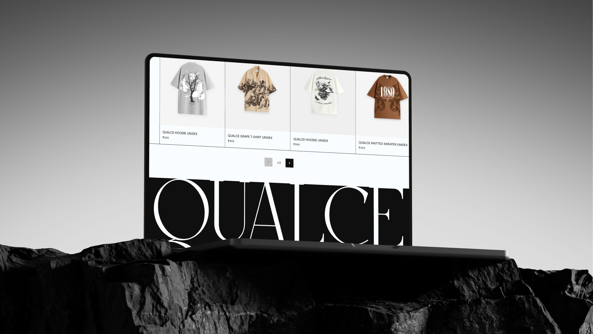
We work the same way on our own branding projects. For Qualce, a luxury knitwear label, we designed the identity and the ecommerce site together so the brand held up across every touchpoint. If you're weighing a refresh, our branding and design services cover the full system, and our post on designing eco-friendly brand identities goes further into building an identity around a clear idea.
Is the Apple Music new logo a success?
It is too early to judge. The logo divides opinion, while the process behind it is widely admired. What Apple has built is a system with a story attached, and identities built that way tend to have a longer life than a straight logo swap.
If you're planning a rebrand, start with the idea and the story, then design the mark. Talk to us if you'd like help with yours.
FAQ
What is the new Apple Music logo?
It is the Apple symbol paired with a bold, lowercase "music" wordmark set in a customized version of SF Pro, shown in black and white. Apple unveiled it on October 21, 2026.
Why did Apple Music change its logo?
Apple built the new identity around the idea "made by sound," using a composition by Fred again.. and NEST Acoustics to physically shape the visuals. The result ties the brand directly to music.
Why is the new Apple Music logo black and white?
Apple dropped the red scheme for a black-and-white logo and icon, and kept color for its launch animations. Apple hasn't said whether color will return to the icon.
When does the new Apple Music icon roll out?
It arrives with iOS 27.2 and macOS 27.2. Apple's website switched to the new branding on launch day.
Written by Vraj Patel, founder of SideFixers, a design studio building brands, websites and digital products since 2022.

Design
/
Vraj Patel
Last verified: October 27, 2026.
On October 22, Canva announced Canva Craft, its first image-generation model. One detail stood out: Craft plans a composition before it renders the image. For founders and marketing leads, that makes Canva Craft AI worth a test for campaign assets and designed layouts. The test is whether it can follow a brand's rules, not just make an attractive picture.
The Verdict
Signal or hype: 4/5 signal: Canva is building around composition and editable output, not image quality alone.
Who should care: Small teams that already make campaign materials in Canva and need versions for several formats.
What we'd do this week: Give it one real campaign brief, then check the layout, copy and brand fit before approving an output.
What Canva Craft changes in image generation
Canva Craft separates image planning from image rendering. Canva says its first model turns a prompt into a plan for the elements, their positions and scale, visual hierarchy and any text. A second model renders that plan into an image. Canva explains the two-stage process in its announcement.
That is a useful design choice when an image has to do a job. A poster, an ad or a social graphic needs more than a subject. It also needs a reading order, room for copy and a focal point. Canva says Craft can make images up to 2K across more than 30 aspect ratios, with editable outputs and the ability to change elements without unnecessarily changing the rest. Those capabilities come from Canva's launch announcement, so teams should check them against their own work.
Canva says it trained Craft on millions of human-made templates from its library, including posters, presentations, menus and layouts with a lot of typography. The company also says its designers assessed more than 25,000 image pairs during internal evaluation. That helps explain the model's focus on design. It does not show whether Craft will follow the visual rules of a particular brand. Canva describes its training and evaluation process here.
Why Canva Craft AI plans a layout first
The planning stage gives a designer more to specify than a general image prompt. A useful brief can name the subject, the reading order, where the copy belongs, how much space to leave open and what should catch the eye first. Canva says Craft represents spatial relationships, relative scale and hierarchy before rendering. The announcement describes the model's architecture.
The design idea is sound: treat hierarchy and placement as part of making the image. Canva says the plan can account for typography and text before rendering, and the company says its model was trained on human-made layouts. That may help with posters and social graphics, where the relationship between headline and image matters. It still needs a visual check. Text can be legible in isolation and too small in a feed; a balanced layout can lose contrast when cropped or resized. Those are checks for the exported asset, not things a launch announcement can settle.
The trade-off is that the plan depends on the brief. If the prompt says nothing about hierarchy, the model has to choose one. If the output needs to match an existing campaign, provide a clear reference and compare the result with it. The architecture can help arrange a composition; it cannot decide which visual choices belong to your brand.
Where the model fits in a brand workflow
Treat Canva Craft as a way to make and revise campaign assets, not a shortcut to a brand system. Canva says Craft is available globally in Dream Lab and through its public API. The API documentation marks image generation as a preview, requiring the asset:write scope and using the user's AI credit allowance. Canva's announcement and API documentation describe these separate routes.
For most small teams, start inside Dream Lab with one asset that has a clear brief and audience. If you want to add generation to another product or workflow, account for the API's preview status, access requirements and credit use before building around it. Canva says its MCP support is coming soon, so treat that as a future option, not a current integration. Canva lists MCP as forthcoming.
One polished output is not enough to judge the test. Compare several outputs against the same brief, then ask three separate questions:
Image quality: Does the subject look right, with the finish this campaign needs?
Layout control: Are the headline area, focal point and open space where the brief asked for them?
Brand fit: Do the color, typography, tone and image style sit naturally beside the assets the company already uses?
This split helps locate the problem. A strong image can have the wrong composition. A well-arranged composition can still feel unlike the brand. Even a close match may need a designer to adjust the copy, spacing or crop before it goes out.
How to test brand consistency
Use one approved campaign brief and keep the test narrow. Choose an asset with a real purpose, such as a product announcement or event graphic. Give Craft the same description, required copy and format for each attempt. Compare the results with an existing brand reference, not with a vague idea of what looks professional.
Check what a customer will notice first: whether the message is readable, the hierarchy matches the brief, the color and imagery feel familiar, and the layout can work in the places where the campaign will appear. Canva says Craft supports text in 55 languages and more than 30 aspect ratios. Those details are in its announcement. Test the copy and export at the size people will see; the launch claim cannot do that review for you.
Before publication, have a designer check the copy, product details, spacing, colors and whether the imagery changes the campaign's meaning. Record any corrections. An impressive image that takes longer to repair may not save time.
When a designer should stay involved
Keep a designer involved when the work sets a new visual direction, establishes an identity or has to hold together across channels. Those jobs require decisions about what the brand should communicate and how its parts relate. A model can suggest material, but someone still has to set the direction and decide what fits.
For recurring campaign production, ask whether the team can make useful variations while keeping the approved design intact. If not, the prompt or template may need work, or a designer may be the better option.
The SideFixers take
We would test Canva Craft on a campaign asset before using it to define a brand. In our BlockMindAI project, we designed a website for an AI and blockchain product. The product still needed a clear visual system around it; a new image alone could not explain what the product does.
Craft's promise is more control over composition and edits. A brand still depends on repeated choices about voice, color, typography and detail. Craft can give a team material to work with; the team has to decide what belongs. That distinction between an asset and the system around it also appears in our look at Apple Music's new logo.
If you are planning a brand or website and want a designer to help set that direction, see how SideFixers approaches design services.
Steal this
Use this test before adding an AI-generated image to a live campaign:
Name the job: Write down the audience, channel and one message the image must carry.
Set the layout: Specify the focal point, copy area, visual order and format.
Keep the brief consistent: Compare outputs using the same prompt and brand reference.
Check the brand: Compare type, color, image style and tone with an approved asset.
Review the export: Check text, crop, spacing and details at the size people will see.
Record repair time: Note each manual correction and decide whether the model made the job easier overall.
Canva Craft AI is worth a structured trial when a team needs designed images inside Canva. We can help set the visual system behind that work.
FAQ
What is Canva Craft?
Canva Craft is Canva's first image-generation model. Canva says it plans an image composition before rendering and makes the model available in Dream Lab and through its public API. Canva's announcement explains the model.
Is Canva Craft available to use?
Canva says Craft is available globally in Dream Lab and through its public API. The image-generation API is marked as a preview and has access and AI-credit requirements. Canva's API documentation has the current details.
Can Canva Craft generate text inside an image?
Canva says Craft can plan text as part of an image composition and generate text in 55 languages. Check the generated copy before using it in a campaign. Canva lists these capabilities in its announcement.
Should a startup use Canva Craft for its brand identity?
Use it to explore or produce campaign assets, then compare them with the brand's approved visual rules. A designer should lead decisions about the identity itself and check that generated assets fit the wider system.
Written by Vraj Patel, founder of SideFixers, a design studio building brands, websites and digital products since 2022.

Business
/
Vraj Patel
Last verified: October 25, 2026.
On October 22, BambooHR reported a 13% rise in paid-time-off requests for GTA 6 launch day, compared with the third Thursday of November in 2024 and 2025. For a small team, November 19 is also a scheduling question. The data shows more requests; it cannot tell us how many people will be away or how much work will be delayed.
The Verdict
Signal or hype: 3/5 signal: PTO requests point to a launch-day bump. I expect a huge worldwide productivity dip in week one, though its scale is unmeasured.
Who should care: Founders and small teams planning a product launch, campaign, or staff schedule.
What we'd do this week: Agree on coverage early and make room for planned leave.
The GTA 6 economic impact starts with a Thursday
Take-Two lists November 19, 2026 as the launch date. BambooHR reports that requests for that Thursday are 13% above the third Thursday of November in 2024 and 2025.
The BambooHR methodology says the company pulled anonymized PTO data on October 19. It covers more than 3.4 million active US employees on its platform, from 2024 to 2026.
The 13% compares request rates, not the number of new absences. BambooHR does not give the request totals, and its platform covers only its US customers. We do not know how many workers will actually be off.
In BambooHR's survey of 1,530 full-time US employees, 18% said they plan to take November 19 off. Half of gamers planning time off for a game release said they expect to call in sick instead of booking PTO. They were describing plans. We do not yet know how many leave requests will be approved or who will show up.
What does the $1 billion estimate count?
The widely repeated $1 billion figure estimates possible short-term output. It does not come from a study of actual absences.
Fortune traced it to economist José García Montalvo and reported that no methodology has been published. IBTimes says the 1.5 million worker count repeated alongside it is unverified.
The Bureau of Labor Statistics measures labor productivity as output per hour worked and excludes paid leave from hours available for production. Multiplying a worker's annual output by one day assumes that day's work disappears for good.
A team may cover urgent work, move a deadline, or catch up later. One absence can still hurt a small business that needs that person on shift.
There is also a substitution effect: someone who uses a vacation day in November may have one fewer day to take in February or June. College of the Holy Cross economist Victor Matheson made that point in Fortune's report.
The date can still create a scheduling problem for a small company, even if the employee's total days off for the year stays the same.
What research papers say about games and work
The clearest academic evidence looks at long-term changes in work. Aguiar, Bils, Charles and Hurst used time-use diaries for their Journal of Political Economy paper.
They estimate that the rising appeal of recreational computing reduced young men's work hours by 2% over a period beginning in 2004. That finding suggests games can compete with work for time; it does not predict what will happen during GTA 6 week. (Paper)
A second study by Fenton and Koenig used the regulated television rollout and Social Security work histories. Published in the American Economic Journal: Applied Economics, it estimates that a station launch reduced the probability of working by about 0.3 percentage points, mainly because more older people retired.
The effect on overall labor-supply trends was smaller than earlier models suggested. Television access over time differs from one game release, so this paper cannot forecast GTA 6's effect. (Paper)
These papers show that entertainment can change how people spend their time. They do not tell us how many will take launch day off, play all week, or delay work. Post-launch attendance and output data will help answer that.
Will people take the whole week off?
One Day commissioned a YouGov survey of 1,000 people in the UK about their plans for GTA 6. On its results page, 7% expect to take launch day off and 4% expect to book several days.
Another 13% expect to play more than 10 hours in the first week; 64% do not expect to play that week.
The survey includes everyone polled, even people who are not interested in the game. These are stated plans, not actual behaviour, and the percentages are not shares of UK workers or gamers.
Some respondents expect to spend many hours playing. The survey does not establish that a large group will take the whole week off.
Some workplaces will feel an absence more than national figures suggest. A small shop may depend on one trained person. A founder still needs a backup, even if the national effect is small.
A design teardown of the headline
Keep the units clear when you read this story. “PTO requests are 13% above a historical comparison” is a change in one platform's data. “18% plan to take a day off” is a survey answer.
“$1 billion in lost output” is an estimate. The three figures answer different questions, even when a headline puts them side by side.
BambooHR compares nearby dates and explains its sources. It leaves out the number of requests behind the percentage, so readers cannot see the size of the increase.
When you read a chart, ask what it counts, who is included, and whether it shows what people did or what they say they might do. Clear design can make the number easier to read, but it cannot make an estimate a fact.
The SideFixers take
I'm a huge gamer, and so is the rest of the SideFixers team. They asked to stop work after 5pm IST on November 19 and get on Discord to play. We agreed. Anyone who needs a break or leave during launch week can take it.
I expect the game to pull people away from work around the world for at least the first week. That is my prediction; the research has not measured a release like this. We'll know more when we can compare attendance and output after launch.
SideFixers started as a side project, and we still build our own work to learn. We made Qualce around intentional rarity. Products have their own audiences and reasons to launch.
Our Apple Music rebrand analysis looks at a different creative launch through a founder's lens.
Steal this
Before scheduling a launch or campaign during a major entertainment release, ask:
Audience: Do customer conversations, analytics, or community channels show that this release matters to our buyers?
Staffing: Which tasks need a backup? Can people take a break or leave that week?
Timing: Can a deadline move by a day without affecting a customer or another team?
Evidence: Are we using our own data, or a survey about what people might do?
Review: After the event, compare attendance, campaign engagement, support volume, and sales with a normal Thursday. Keep the change if your data supports it.
We will see how far the GTA 6 economic impact reaches beyond our studio when post-launch attendance and output data come in. Until then, this is my prediction. For a launch plan built around your customers and team, start a project with SideFixers.
FAQ
Will GTA 6's launch affect the economy?
It may shift some work hours and spending around launch. Available PTO data points to higher requests around the release date, but there is no post-launch evidence yet to measure the national effect.
Will people take a week off to play GTA 6?
Some people may book multiple days, but one UK survey found 4% of all respondents expect to book several days. It does not show that a large share of workers will take a full week.
Is the $1 billion GTA 6 productivity estimate a research finding?
No. It is a circulated estimate without a published study or verified national count of launch-day absences. Treat it as a scenario, not a measured loss.
What should employers do for the GTA 6 launch?
Check planned leave, make coverage visible, and use your own customer and attendance data to decide whether a launch or campaign needs to move.
Written by Vraj Patel, founder of SideFixers, a design studio building brands, websites and digital products since 2022.
Topics
ALL TOPICS
BUSINESS
DESIGN
DEVELOPMENT
BRANDING
RESEARCH
Branding
/
Vraj Patel
In today’s world, sustainability is more than just a trend—it's a movement that's reshaping industries and consumer behavior alike. As environmental awareness continues to grow, companies are increasingly seeking ways to align their brand identities with eco-friendly values. This shift has given rise to "green branding," where businesses design their brand identities to reflect a commitment to sustainability. But how can companies create a brand that truly resonates with eco-conscious consumers? Let’s dive into the essentials of green branding and explore how to design an eco-friendly brand identity that stands out.
Understanding Green Branding
Green branding is the practice of creating a brand identity that emphasizes sustainability, ethical practices, and environmental responsibility. It goes beyond using green colors or nature-inspired imagery—it's about integrating sustainability into the core values and operations of a company. Green branding communicates a company’s commitment to the planet, making it a key differentiator in a market where consumers are increasingly looking for brands that align with their values.
Key Elements of Eco-Friendly Brand Identities
1. Visual Identity
The visual aspects of a brand, including the logo, color palette, and packaging, play a significant role in conveying eco-friendliness. Colors like green, earthy tones, and natural textures can evoke a sense of nature and sustainability. However, it’s crucial to ensure that these elements are more than just superficial. For instance, using sustainable materials for packaging or creating a logo that symbolizes environmental consciousness can reinforce a brand’s green commitment.
2. Brand Messaging
Authenticity is at the heart of green branding. Consumers are quick to spot greenwashing—where a company falsely claims to be environmentally friendly—so it’s important that brand messaging is transparent and genuine. Brands should communicate their sustainability initiatives, ethical sourcing, and environmental impact in a clear and honest way. This can be done through storytelling, where the brand shares its journey towards becoming more sustainable, highlighting both achievements and challenges.
3. Sustainability Certifications and Symbols
Incorporating recognized sustainability certifications into the brand identity adds credibility. Certifications like Fair Trade, USDA Organic, or Carbon Neutral signal to consumers that the brand’s eco-friendly claims are backed by third-party verification. These symbols can be prominently featured on packaging, in marketing materials, and on the brand’s website to build trust and reinforce the company’s commitment to sustainability.
Case Studies: Brands Doing Green Right
Let’s look at a few brands that have successfully embraced green branding:
Patagonia: Known for its commitment to environmental activism, Patagonia’s brand identity is deeply rooted in sustainability. From using recycled materials in their products to pledging 1% of sales to environmental causes, Patagonia has built a brand that not only promotes sustainability but actively engages in it.
Seventh Generation: This household product company has made sustainability its core mission. Their branding focuses on transparency, from the ingredients in their products to their commitment to plant-based and biodegradable materials. The company’s name itself is a nod to the Iroquois philosophy of considering the impact of decisions on the next seven generations.
Challenges in Green Branding
Green branding isn’t without its challenges. One of the most significant risks is greenwashing, where a brand exaggerates or fabricates its environmental efforts. This can lead to a loss of consumer trust and can be difficult to recover from. Additionally, sourcing sustainable materials can be more costly and logistically complex, which can pose challenges for companies looking to scale their eco-friendly efforts.
Steps to Create an Eco-Friendly Brand Identity
1. Conduct a Sustainability Audit
Start by evaluating your company’s current environmental impact. Identify areas where you can improve, whether it's reducing waste, sourcing sustainable materials, or improving energy efficiency.
2. Engage Stakeholders
Involve employees, customers, and suppliers in your green branding efforts. Their insights and support can help ensure that your sustainability initiatives are authentic and impactful.
3. Design with Sustainability in Mind
When developing your brand’s visual identity, consider the environmental impact of your design choices. Use recycled materials for packaging, opt for eco-friendly inks, and explore ways to minimize waste in your production process.
The Future of Green Branding
As technology advances, new opportunities for green branding are emerging. For example, blockchain technology can be used to enhance supply chain transparency, allowing consumers to trace the journey of a product from raw materials to finished goods. Additionally, as more consumers prioritize sustainability, we can expect to see a continued shift towards brands that not only talk the talk but walk the walk when it comes to environmental responsibility.
Conclusion
Green branding is more than just a marketing strategy—it’s a commitment to creating a better future for the planet. By designing eco-friendly brand identities, companies can connect with consumers on a deeper level, building trust and loyalty. As the demand for sustainable products continues to rise, now is the perfect time for brands to embrace green branding and make a meaningful impact on the world.
Development
/
Vraj Patel
In today's fast-paced digital world, building a professional website no longer requires deep technical knowledge. Thanks to no-code website builders, anyone can create beautiful, functional websites in a matter of hours. Whether you're a freelancer, a small business owner, or a startup, these platforms offer a wide range of tools to help you get online quickly and easily. Here are the top 10 no-code website builders to consider in September 2024.
1. Framer
Framer continues to shine as one of the most robust no-code website builders, particularly for designers who want pixel-perfect control over their websites. Originally a prototyping tool, Framer has evolved into a full-fledged website builder with smooth animations, interactive components, and seamless collaboration features.
Free Plan: Build up to 3 websites with 1,000 visitors per month.
Paid Plans: The Mini plan starts at $5/month, offering a custom domain and the same visitor limit. For higher traffic and features like CMS collections and code embeds, plans such as Basic ($15/month) and Pro ($30/month) are available.
Why Choose Framer?
Framer’s combination of design-focused too and advanced interactivity makes it ideal for designers who want to focus on the details. If you're familiar with Figma, you'll find Framer's environment intuitive and powerful.
2. Webflow
Webflow offers the flexibility of a traditional development environment with the simplicity of a visual builder. It allows users to build custom websites without touching a single line of code, but it also provides an open door to custom coding for those who want to fine-tune their designs.
Free Plan: Start with up to two projects, but with Webflow branding.
Paid Plans: Pricing starts at $14/month for the Basic plan, which includes a custom domain. More advanced plans like CMS ($23/month) offer dynamic content capabilities, making it suitable for blogs, portfolios, and content-rich websites.
Why Choose Webflow?
Webflow is perfect for designers and agencies that need more advanced features, particularly around content management and responsive design. It’s also ideal for those who want to take advantage of custom code later down the line.
3. Wix Studio
Wix Studio offers everything users love about Wix, but with additional design freedom and control over layouts. This tool is great for those who appreciate Wix’s ease of use but require more flexibility when creating complex websites.
Free Plan: Comes with Wix branding and subdomains.
Paid Plans: Start at $16/month, which includes a custom domain and more storage space. Business and e-commerce plans start at $27/month, ideal for companies needing a robust online store .
Why Choose Wix Studio?
Wix Studio offers an intuitive user experience while also providing the ability to create highly customized sites. It's an excellent balance between ease of use and design freedom.
4. Squarespace
Squarespace remains one of the most popular website builders due to its sleek templates and comprehensive set of features. It’s especially well-suited for creatives looking to showcase portfolios or for small businesses in need of e-commerce features.
Free Plan: Not available, but you can try Squarespace with a 14-day free trial.
Paid Plans: Start at $16/month for personal sites, with higher plans (starting at $23/month) offering advanced e-commerce capabilities .
Why Choose Squarespace?
Squarespace excels in aesthetic appeal, making it the platform of choice for designers, photographers, and creative professionals. Its templates are some of the most beautifully designed in the market, and the platform also provides strong blogging tools.
5. Editor X
From the makers of Wix, Editor X offers the next level of website creation for designers and agencies. With full CSS grid layout control and advanced responsiveness, it's designed for creating intricate, pixel-perfect websites without the hassle of manual coding.
Free Plan: Build sites with Editor X branding and a Wix subdomain.
Paid Plans: Start at $22/month, including custom domains, expanded bandwidth, and increased storage .
Why Choose Editor X?
For users who want total design control, especially regarding responsiveness and layout precision, Editor X is the top choice. Its powerful tools and flexibility make it ideal for design agencies and developers who need high-level customization.
6. Carrd
Carrd is known for its simplicity and is one of the most cost-effective solutions for creating single-page websites. Ideal for landing pages, portfolios, and online resumes, Carrd’s intuitive interface and minimalistic approach make website building fast and easy.
Free Plan: Build up to three one-page sites with Carrd branding.
Paid Plans: Start at $9/year for custom domains and additional features like form integrations .
Why Choose Carrd?
If you need to build a simple, one-page site quickly and affordably, Carrd is the perfect solution. It’s also an excellent option for portfolios, landing pages, or simple product pages.
7. Bubble
Bubble stands out as one of the most powerful no-code platforms, particularly for building complex, dynamic web apps without coding. Whether you're developing a SaaS product, marketplace, or social network, Bubble provides the tools to handle it.
Free Plan: Allows building web apps with limited functionality and Bubble branding.
Paid Plans: Start at $29/month, unlocking custom domains and more advanced app features .
Why Choose Bubble?
For users building dynamic, interactive web applications with heavy functionality—like databases, user accounts, and integrations—Bubble is the clear winner. Its flexibility allows for creating virtually any kind of web app without needing technical expertise.
8. Weebly
Weebly, now part of the Square ecosystem, is an easy-to-use builder particularly suited for small businesses looking to combine website creation with simple e-commerce options. It’s intuitive and offers seamless integration with Square’s payment system.
Free Plan: Build websites with Weebly branding and subdomains.
Paid Plans: Start at $12/month for custom domains and expanded storage .
Why Choose Weebly?
For small businesses needing a simple and affordable solution that integrates with Square for payments, Weebly is an ideal choice. It's user-friendly and great for beginners.
9. Tilda
Tilda is a builder focused on storytelling and content-driven websites. It offers a modular block system, allowing you to create long-form content with ease. It's popular with designers and marketers looking to combine beautiful visuals with informative content.
Free Plan: Build one website with Tilda branding.
Paid Plans: Start at $15/month for custom domains and advanced features like more storage and page analytics .
Why Choose Tilda?
Tilda is the best platform for users who need to create long-form, storytelling websites, such as blogs, portfolios, or educational sites. Its simple yet effective tools allow for creating engaging and interactive pages.
10. Zyro
Zyro is a budget-friendly option for individuals and small businesses looking to build websites quickly. With AI-driven tools that assist in content creation and design, Zyro simplifies the process without sacrificing quality.
Free Plan: Includes Zyro branding and a subdomain.
Paid Plans: Start at $2.90/month, making it one of the most affordable platforms on the list .
Why Choose Zyro?
For users on a tight budget or those looking to get a site up fast, Zyro offers a streamlined, cost-effective solution. It’s a great option for beginners looking for an easy-to-use platform that doesn’t compromise on features.
Conclusion
Every no-code website builder on this list offers a free plan, allowing you to test their tools before committing to a paid subscription. Each platform caters to different needs, from simple portfolios to complex web apps, so be sure to choose one that fits your vision and goals. Paid plans start as low as $2.90/month, offering more advanced features like custom domains, increased storage, and dynamic content.
Pick the right tool, and start building your online presence today!
Research
/
Vraj Patel
In the creative world, terms like "agency" and "studio" are often used interchangeably. However, understanding the differences between the two can help businesses make more informed decisions when seeking creative services. Let’s dive into the top 7 differences between an agency and a studio.
1. Scope of Services
Agency: Agencies typically offer a wide range of services, covering various aspects of marketing, branding, digital strategy, and more. They are often full-service, meaning they handle everything from market research and campaign planning to execution and analytics.
Studio: Studios, on the other hand, are usually more specialized. They often focus on one or a few areas of expertise, such as graphic design, animation, or photography. Studios provide high-quality work in their niche but may not offer the broader scope of services that an agency does.
2. Team Structure
Agency: Agencies usually have larger teams that include a mix of professionals like account managers, strategists, designers, copywriters, developers, and analysts. This diverse team composition allows agencies to tackle a variety of projects simultaneously and provide comprehensive solutions.
Studio: Studios often have smaller, more focused teams. The team may consist of a few key creative professionals who excel in specific disciplines. This structure allows studios to maintain a high level of craftsmanship and attention to detail in their work.
3. Client Relationships
Agency: Agencies tend to work with clients on a long-term basis, managing ongoing projects and campaigns. The relationship is often more strategic, with the agency acting as an extension of the client’s own team. Agencies often have dedicated account managers who handle client communication and project coordination.
Studio: Studios usually engage with clients on a project-by-project basis. The focus is often on delivering a specific creative output rather than managing a long-term relationship. Studios are typically brought in for their expertise in a particular area when a client needs high-quality, specialized work.
4. Approach to Projects
Agency: Agencies take a holistic approach to projects, considering all aspects of a brand’s presence and how different marketing activities can work together. They often start with a strategy phase to align on goals and objectives before moving into execution.
Studio: Studios are more execution-focused. They are usually brought in once a strategy has been defined, and their role is to bring that strategy to life through their specialized creative skills. Studios excel at translating ideas into visually compelling outputs.
5. Pricing Models
Agency: Agencies often use retainer-based pricing models, especially for long-term clients. This means clients pay a set fee each month for ongoing services. Agencies may also charge project-based fees, especially for one-off campaigns or projects.
Studio: Studios typically charge on a project basis, with fees determined by the scope and complexity of the work. Because studios are usually brought in for specific projects, their pricing is often more straightforward and tied directly to the deliverables.
6. Flexibility and Agility
Agency: Agencies are designed to handle multiple clients and projects simultaneously, which can sometimes make them less flexible when it comes to last-minute changes or highly customized requests. However, their broad range of expertise allows them to pivot quickly when necessary.
Studio: Studios, with their smaller teams and specialized focus, often have more flexibility and can adapt quickly to changes or unique project requirements. This agility allows them to deliver highly customized and creative solutions.
7. Brand Identity and Culture
Agency: Agencies often have a distinct brand identity and culture that reflects their broad range of services and client base. They may work across various industries and market segments, which can lead to a diverse and dynamic workplace culture.
Studio: Studios usually have a strong, niche identity that reflects their specific area of expertise. This focused identity often attracts like-minded clients and fosters a creative environment where artistic vision and innovation are at the forefront.
Conclusion
Choosing between an agency and a studio depends on your specific needs and the nature of your project. If you’re looking for a comprehensive, strategic partner that can handle multiple facets of your marketing and branding efforts, an agency might be the right choice. If you need specialized, high-quality creative work for a specific project, a studio could be the perfect fit.
At Sidefixers Design Agency, we pride ourselves on offering the best of both worlds—comprehensive services with a specialized, creative approach. Contact us today to learn how we can help elevate your brand!
Design
/
Vraj Patel
In the dynamic world of design, the marriage of creativity and organization is where true magic happens. Design project management serves as the compass that navigates the journey from concept to completion, ensuring that every stroke of creativity aligns with strategic goals and deadlines. In this comprehensive guide, we delve into the essential principles of effective design project management to help you orchestrate seamless and successful creative endeavors.
1. Establish Clear Objectives and Scope Definition
Before the first sketch is drawn or the initial code is written, it's crucial to lay a solid foundation. Clearly defining the objectives of the design project and establishing its scope are paramount. What are the goals? Who is the target audience? What deliverables are expected? By answering these questions upfront, you set the stage for a focused and purposeful project.
2. Foster Collaboration and Communication
Design is inherently a collaborative process. Establishing open lines of communication from the outset is essential. Regular team meetings, brainstorming sessions, and feedback loops are vital for ensuring everyone is on the same page. Leveraging tools like project management platforms, collaborative design software, and communication channels fosters a culture of teamwork and ensures effective collaboration.
3. Set Realistic Timelines and Milestones
Time is both a constraint and a valuable resource in design project management. Breaking down the project into manageable phases, each with its own set of milestones, is crucial. Realistic timelines not only keep the team on track but also allow for adjustments and iterations. It's important to strike the delicate balance between creativity and deadlines.
4. Embrace Flexibility: Iteration is Key
Design is an iterative process. Embracing flexibility in your project management approach is essential. Anticipate and welcome changes, feedback, and new insights. A well-managed design project is not rigid but adaptable, allowing for continuous improvement and refinement.
5. Utilize Design Tools and Technologies
In the digital age, design tools and technologies are indispensable assets for efficient project management. From prototyping tools to version control systems, leveraging the advancements in design technology streamlines workflows, enhances collaboration, and contributes to the overall efficiency of the design process.
6. Ensure Quality Assurance and Testing
Maintaining the integrity of your design is paramount. Implementing robust quality assurance and testing processes is essential. Whether it's user testing for a new app interface or proofing for a print design, meticulous attention to detail is crucial. A well-managed design project includes thorough testing phases to identify and rectify any issues before the final delivery.
7. Foster Client Collaboration: Building Lasting Partnerships
In many design projects, client collaboration is integral to success. Maintaining transparent communication with clients, involving them in key decision-making processes, and seeking their input throughout the project are critical. A collaborative approach fosters trust and often leads to more satisfying end results.
8. Celebrate Success and Learn from Challenges
At the conclusion of each design project, take the time to celebrate successes and achievements. Equally important is the post-project evaluation. What worked well? What challenges were encountered, and how can they be addressed in future projects? Learning from both triumphs and setbacks is the cornerstone of continuous improvement.
In conclusion, mastering design project management is the key to unlocking the full potential of creative endeavors. By implementing the principles outlined in this guide – from clear objectives to flexible adaptation and client collaboration – you pave the way for design projects that not only meet expectations but exceed them. Embrace the art of design project management, and watch your creative visions seamlessly come to life.
Business
/
Vraj Patel
Apple Vision Pro and its new system, visionOS, are like super-powered goggles that let you see and interact with digital things in the real world. This is super exciting for design agencies, which are companies that make designs and apps. They can now make awesome new apps for these goggles and help other businesses use this cool technology.
What is visionOS and Apple Vision Pro?
Apple Vision Pro is a new device that combines augmented reality (AR) and virtual reality (VR). This means it can show digital images and animations that blend into the real world around you. visionOS is the software that runs on these goggles, making all the magic happen.
How Design Agencies Can Make Awesome Apps for visionOS
Making Cool Apps
Design agencies can create different types of apps for visionOS. These apps can help people do work, learn new things, play games, and much more. By using their skills in making apps look and work great, agencies can create experiences that feel real and exciting.
Finding Clients
There are lots of new companies that work with AI (artificial intelligence) and other established businesses that want to try out Apple Vision Pro. Design agencies can help these companies by making special apps for them. This way, the companies can do cool new things with the AR/VR technology.
How Agencies Can Convince Companies to Use visionOS Apps
Showing the Benefits
To get companies interested in visionOS apps, agencies can explain why these apps are awesome:
• More Fun and Engaging: visionOS apps make everything more interactive and fun, which people love.
• Stand Out: Companies can be seen as cool and innovative if they use this new technology.
• Flexible: These apps can be used for lots of different purposes, from teaching to shopping.
Real Examples
Agencies can show examples of their previous work or make small demo apps to show companies what’s possible. This helps companies see the potential of visionOS apps.
Offering Full Services
Design agencies can do everything from start to finish:
• Research and Ideas: Finding out what people need and coming up with great app ideas.
• Designing: Making the app look and feel awesome.
• Building and Testing: Creating the app and making sure it works perfectly.
• Ongoing Help: Keeping the app updated and fixing any issues.
Sidefixers Agency: Leading in visionOS UX/UI Design
Sidefixers Agency is a top design agency that knows a lot about making apps for Apple Vision Pro and other devices. Their team is great at creating user-friendly and exciting apps for visionOS.
Why Choose Sidefixers Agency?
• visionOS Experts: They are always learning the latest in AR/VR technology.
• Customer Focused: They work closely with clients to understand their needs and deliver the best results.
• Proven Success: They have a portfolio of successful projects across various industries.
Conclusion
Apple Vision Pro and visionOS are opening up new, exciting possibilities for design agencies. By creating apps for this platform, agencies can help businesses use this amazing technology. Sidefixers Agency is proud to offer top-notch design services for visionOS, helping businesses create engaging digital experiences. As more people want visionOS apps, design agencies that jump on this opportunity will do really well.
To learn more about how Sidefixers Agency can help you with visionOS app design, visit our website and check out our services. Let’s make the future of digital experiences together!
Branding
/
Vraj Patel
On October 21, 2026, Apple unveiled the Apple Music new logo and a full identity built around one idea: "made by sound." The red is gone, the wordmark is heavier, and the mark itself was shaped by filming music as it rippled through a shallow bath of mineral oil. It is the service's first logo change in 11 years, and it has already split opinion.
Most coverage stops at what changed. This post looks at why Apple did it this way, and what founders and marketing leads can borrow without an Apple-sized budget.
Key takeaways
The new Apple Music logo pairs the Apple symbol with a bold, lowercase wordmark set in a customized SF Pro, in black and white.
The visuals were captured in camera. Notes from a composition by Fred again.. and NEST Acoustics vibrated a bath of mineral oil, and the ripples were filmed.
Dropping a signature color is a real risk. It works when something else carries recognition.
The making-of story does as much work as the logo, and smaller brands can use the same approach.
What changed in the Apple Music rebrand
Apple announced the identity on X as "physically shaped by an original composition," and its launch film says the logo was "captured entirely in camera." The work was made with agency TBWA\Media Arts Lab, musician Fred again.. and studio NEST Acoustics, according to Adweek.
Color: the red scheme is gone. The logo and icon are black and white, with color kept for motion pieces.
Wordmark: the lighter "Music" becomes a bold, lowercase "music" in a customized SF Pro.
App icon: the red gradient note becomes a simpler black-and-white design.
Sound: new. A short composition now doubles as a sonic signature.
MacRumors reported that Apple's website switched to the new look the same day, and that the icon rolls out with iOS 27.2 and macOS 27.2. None of this was a complete surprise. The wordmark appeared at Apple Music Hall in London in September and in iOS 27.2 betas in early October, so the launch confirmed what people had spotted weeks earlier.
How the new Apple Music logo was made
Creative Boom describes the process in detail. Fred again.. and NEST Acoustics wrote a short piece and broke it into individual notes. Each note ran through a transducer, a device that turns audio into vibration, which moved a shallow bath of mineral oil. Cameras filmed the ripples and the way light bent through them, and that footage became the raw material for the identity.
The team spent months experimenting, and not every note produced something usable. Wallpaper frames the result as sound turned into liquid. Apple has used this approach before: its 2025 Apple TV rebrand also relied on practical, in-camera effects.
The method fits the product, which is why it works. A music service whose logo was physically shaped by music has a story that explains itself in one sentence.
Why dropping the red is a bold call
Color is often the first thing people associate with a brand, and one of the hardest things to give up. When the black-and-white icon first leaked in beta, many users pushed back. Creative Bloq ran one piece calling the logo "miserable" and another arguing that it signals the end of minimalism. Even commenters who disliked the icon praised the film.
Apple can take this risk because recognition doesn't depend on the red. The Apple symbol carries most of it, and the new sonic signature adds another cue. Color hasn't disappeared, either. It has moved into motion, and the launch visuals are full of it.
For a smaller company, the lesson is not to drop your color. It is to understand what your brand actually depends on before you change it. Ask a handful of customers to describe your brand without looking at it. If color comes up first, keep it. If you do retire a signature element, introduce a replacement (a sound, a shape, a type style) at the same time, so people have something new to recognize. A neutral core mark with color living in campaigns, product UI or motion is a sensible pattern for many brands, and it is the one Apple has chosen here.
Process as story: why the making-of matters
The Apple Music rebrand was covered across tech, design and music press on launch day, and much of that coverage, from Creative Boom to Wallpaper, led with the mineral oil rather than the letterforms. The making-of film is effectively the launch campaign.
This is where startups can learn the most. A reveal that says "here's our new logo" gives people nothing to pass on. One that shows how and why it was made gives journalists, customers and your own team a story to retell.
You don't need cameras and a tank of oil to do this:
Show the sketches. Early concepts, rejected directions and the reasoning behind the final choice make strong launch content.
Tie the method to the product. Apple used sound for a music app. A fintech brand could build a pattern from real transaction data, and a fashion label could scan its own fabric.
Credit the people involved. Apple named the musician, the studio and the agency, and naming your designers and collaborators adds the same credibility.
Publish the story on your own site first, so the coverage and backlinks point to you.
What a startup can borrow without Apple's budget
Start with one idea. "Made by sound" is three words. Write yours before anyone opens a design tool.
Design a system, not just a mark. Apple shipped a wordmark, icon, motion language and sound together. Even a small brand should launch with type, color and usage rules rather than a lone logo file.
Plan the rollout. Apple's identity appeared at a venue, then in betas, then everywhere. Stage yours across website, product, social and sales materials so nothing still shows the old brand.
Give it time. Early reaction to a rebrand is often negative, as Apple's was. Judge yours after people have lived with it for a few months, not in the first 48 hours.
We work the same way on our own branding projects. For Qualce, a luxury knitwear label, we designed the identity and the ecommerce site together so the brand held up across every touchpoint. If you're weighing a refresh, our branding and design services cover the full system, and our post on designing eco-friendly brand identities goes further into building an identity around a clear idea.
Is the Apple Music new logo a success?
It is too early to judge. The logo divides opinion, while the process behind it is widely admired. What Apple has built is a system with a story attached, and identities built that way tend to have a longer life than a straight logo swap.
If you're planning a rebrand, start with the idea and the story, then design the mark. Talk to us if you'd like help with yours.
FAQ
What is the new Apple Music logo?
It is the Apple symbol paired with a bold, lowercase "music" wordmark set in a customized version of SF Pro, shown in black and white. Apple unveiled it on October 21, 2026.
Why did Apple Music change its logo?
Apple built the new identity around the idea "made by sound," using a composition by Fred again.. and NEST Acoustics to physically shape the visuals. The result ties the brand directly to music.
Why is the new Apple Music logo black and white?
Apple dropped the red scheme for a black-and-white logo and icon, and kept color for its launch animations. Apple hasn't said whether color will return to the icon.
When does the new Apple Music icon roll out?
It arrives with iOS 27.2 and macOS 27.2. Apple's website switched to the new branding on launch day.
Written by Vraj Patel, founder of SideFixers, a design studio building brands, websites and digital products since 2022.
Design
/
Vraj Patel
Last verified: October 27, 2026.
On October 22, Canva announced Canva Craft, its first image-generation model. One detail stood out: Craft plans a composition before it renders the image. For founders and marketing leads, that makes Canva Craft AI worth a test for campaign assets and designed layouts. The test is whether it can follow a brand's rules, not just make an attractive picture.
The Verdict
Signal or hype: 4/5 signal: Canva is building around composition and editable output, not image quality alone.
Who should care: Small teams that already make campaign materials in Canva and need versions for several formats.
What we'd do this week: Give it one real campaign brief, then check the layout, copy and brand fit before approving an output.
What Canva Craft changes in image generation
Canva Craft separates image planning from image rendering. Canva says its first model turns a prompt into a plan for the elements, their positions and scale, visual hierarchy and any text. A second model renders that plan into an image. Canva explains the two-stage process in its announcement.
That is a useful design choice when an image has to do a job. A poster, an ad or a social graphic needs more than a subject. It also needs a reading order, room for copy and a focal point. Canva says Craft can make images up to 2K across more than 30 aspect ratios, with editable outputs and the ability to change elements without unnecessarily changing the rest. Those capabilities come from Canva's launch announcement, so teams should check them against their own work.
Canva says it trained Craft on millions of human-made templates from its library, including posters, presentations, menus and layouts with a lot of typography. The company also says its designers assessed more than 25,000 image pairs during internal evaluation. That helps explain the model's focus on design. It does not show whether Craft will follow the visual rules of a particular brand. Canva describes its training and evaluation process here.
Why Canva Craft AI plans a layout first
The planning stage gives a designer more to specify than a general image prompt. A useful brief can name the subject, the reading order, where the copy belongs, how much space to leave open and what should catch the eye first. Canva says Craft represents spatial relationships, relative scale and hierarchy before rendering. The announcement describes the model's architecture.
The design idea is sound: treat hierarchy and placement as part of making the image. Canva says the plan can account for typography and text before rendering, and the company says its model was trained on human-made layouts. That may help with posters and social graphics, where the relationship between headline and image matters. It still needs a visual check. Text can be legible in isolation and too small in a feed; a balanced layout can lose contrast when cropped or resized. Those are checks for the exported asset, not things a launch announcement can settle.
The trade-off is that the plan depends on the brief. If the prompt says nothing about hierarchy, the model has to choose one. If the output needs to match an existing campaign, provide a clear reference and compare the result with it. The architecture can help arrange a composition; it cannot decide which visual choices belong to your brand.
Where the model fits in a brand workflow
Treat Canva Craft as a way to make and revise campaign assets, not a shortcut to a brand system. Canva says Craft is available globally in Dream Lab and through its public API. The API documentation marks image generation as a preview, requiring the asset:write scope and using the user's AI credit allowance. Canva's announcement and API documentation describe these separate routes.
For most small teams, start inside Dream Lab with one asset that has a clear brief and audience. If you want to add generation to another product or workflow, account for the API's preview status, access requirements and credit use before building around it. Canva says its MCP support is coming soon, so treat that as a future option, not a current integration. Canva lists MCP as forthcoming.
One polished output is not enough to judge the test. Compare several outputs against the same brief, then ask three separate questions:
Image quality: Does the subject look right, with the finish this campaign needs?
Layout control: Are the headline area, focal point and open space where the brief asked for them?
Brand fit: Do the color, typography, tone and image style sit naturally beside the assets the company already uses?
This split helps locate the problem. A strong image can have the wrong composition. A well-arranged composition can still feel unlike the brand. Even a close match may need a designer to adjust the copy, spacing or crop before it goes out.
How to test brand consistency
Use one approved campaign brief and keep the test narrow. Choose an asset with a real purpose, such as a product announcement or event graphic. Give Craft the same description, required copy and format for each attempt. Compare the results with an existing brand reference, not with a vague idea of what looks professional.
Check what a customer will notice first: whether the message is readable, the hierarchy matches the brief, the color and imagery feel familiar, and the layout can work in the places where the campaign will appear. Canva says Craft supports text in 55 languages and more than 30 aspect ratios. Those details are in its announcement. Test the copy and export at the size people will see; the launch claim cannot do that review for you.
Before publication, have a designer check the copy, product details, spacing, colors and whether the imagery changes the campaign's meaning. Record any corrections. An impressive image that takes longer to repair may not save time.
When a designer should stay involved
Keep a designer involved when the work sets a new visual direction, establishes an identity or has to hold together across channels. Those jobs require decisions about what the brand should communicate and how its parts relate. A model can suggest material, but someone still has to set the direction and decide what fits.
For recurring campaign production, ask whether the team can make useful variations while keeping the approved design intact. If not, the prompt or template may need work, or a designer may be the better option.
The SideFixers take
We would test Canva Craft on a campaign asset before using it to define a brand. In our BlockMindAI project, we designed a website for an AI and blockchain product. The product still needed a clear visual system around it; a new image alone could not explain what the product does.
Craft's promise is more control over composition and edits. A brand still depends on repeated choices about voice, color, typography and detail. Craft can give a team material to work with; the team has to decide what belongs. That distinction between an asset and the system around it also appears in our look at Apple Music's new logo.
If you are planning a brand or website and want a designer to help set that direction, see how SideFixers approaches design services.
Steal this
Use this test before adding an AI-generated image to a live campaign:
Name the job: Write down the audience, channel and one message the image must carry.
Set the layout: Specify the focal point, copy area, visual order and format.
Keep the brief consistent: Compare outputs using the same prompt and brand reference.
Check the brand: Compare type, color, image style and tone with an approved asset.
Review the export: Check text, crop, spacing and details at the size people will see.
Record repair time: Note each manual correction and decide whether the model made the job easier overall.
Canva Craft AI is worth a structured trial when a team needs designed images inside Canva. We can help set the visual system behind that work.
FAQ
What is Canva Craft?
Canva Craft is Canva's first image-generation model. Canva says it plans an image composition before rendering and makes the model available in Dream Lab and through its public API. Canva's announcement explains the model.
Is Canva Craft available to use?
Canva says Craft is available globally in Dream Lab and through its public API. The image-generation API is marked as a preview and has access and AI-credit requirements. Canva's API documentation has the current details.
Can Canva Craft generate text inside an image?
Canva says Craft can plan text as part of an image composition and generate text in 55 languages. Check the generated copy before using it in a campaign. Canva lists these capabilities in its announcement.
Should a startup use Canva Craft for its brand identity?
Use it to explore or produce campaign assets, then compare them with the brand's approved visual rules. A designer should lead decisions about the identity itself and check that generated assets fit the wider system.
Written by Vraj Patel, founder of SideFixers, a design studio building brands, websites and digital products since 2022.
Business
/
Vraj Patel
Last verified: October 25, 2026.
On October 22, BambooHR reported a 13% rise in paid-time-off requests for GTA 6 launch day, compared with the third Thursday of November in 2024 and 2025. For a small team, November 19 is also a scheduling question. The data shows more requests; it cannot tell us how many people will be away or how much work will be delayed.
The Verdict
Signal or hype: 3/5 signal: PTO requests point to a launch-day bump. I expect a huge worldwide productivity dip in week one, though its scale is unmeasured.
Who should care: Founders and small teams planning a product launch, campaign, or staff schedule.
What we'd do this week: Agree on coverage early and make room for planned leave.
The GTA 6 economic impact starts with a Thursday
Take-Two lists November 19, 2026 as the launch date. BambooHR reports that requests for that Thursday are 13% above the third Thursday of November in 2024 and 2025.
The BambooHR methodology says the company pulled anonymized PTO data on October 19. It covers more than 3.4 million active US employees on its platform, from 2024 to 2026.
The 13% compares request rates, not the number of new absences. BambooHR does not give the request totals, and its platform covers only its US customers. We do not know how many workers will actually be off.
In BambooHR's survey of 1,530 full-time US employees, 18% said they plan to take November 19 off. Half of gamers planning time off for a game release said they expect to call in sick instead of booking PTO. They were describing plans. We do not yet know how many leave requests will be approved or who will show up.
What does the $1 billion estimate count?
The widely repeated $1 billion figure estimates possible short-term output. It does not come from a study of actual absences.
Fortune traced it to economist José García Montalvo and reported that no methodology has been published. IBTimes says the 1.5 million worker count repeated alongside it is unverified.
The Bureau of Labor Statistics measures labor productivity as output per hour worked and excludes paid leave from hours available for production. Multiplying a worker's annual output by one day assumes that day's work disappears for good.
A team may cover urgent work, move a deadline, or catch up later. One absence can still hurt a small business that needs that person on shift.
There is also a substitution effect: someone who uses a vacation day in November may have one fewer day to take in February or June. College of the Holy Cross economist Victor Matheson made that point in Fortune's report.
The date can still create a scheduling problem for a small company, even if the employee's total days off for the year stays the same.
What research papers say about games and work
The clearest academic evidence looks at long-term changes in work. Aguiar, Bils, Charles and Hurst used time-use diaries for their Journal of Political Economy paper.
They estimate that the rising appeal of recreational computing reduced young men's work hours by 2% over a period beginning in 2004. That finding suggests games can compete with work for time; it does not predict what will happen during GTA 6 week. (Paper)
A second study by Fenton and Koenig used the regulated television rollout and Social Security work histories. Published in the American Economic Journal: Applied Economics, it estimates that a station launch reduced the probability of working by about 0.3 percentage points, mainly because more older people retired.
The effect on overall labor-supply trends was smaller than earlier models suggested. Television access over time differs from one game release, so this paper cannot forecast GTA 6's effect. (Paper)
These papers show that entertainment can change how people spend their time. They do not tell us how many will take launch day off, play all week, or delay work. Post-launch attendance and output data will help answer that.
Will people take the whole week off?
One Day commissioned a YouGov survey of 1,000 people in the UK about their plans for GTA 6. On its results page, 7% expect to take launch day off and 4% expect to book several days.
Another 13% expect to play more than 10 hours in the first week; 64% do not expect to play that week.
The survey includes everyone polled, even people who are not interested in the game. These are stated plans, not actual behaviour, and the percentages are not shares of UK workers or gamers.
Some respondents expect to spend many hours playing. The survey does not establish that a large group will take the whole week off.
Some workplaces will feel an absence more than national figures suggest. A small shop may depend on one trained person. A founder still needs a backup, even if the national effect is small.
A design teardown of the headline
Keep the units clear when you read this story. “PTO requests are 13% above a historical comparison” is a change in one platform's data. “18% plan to take a day off” is a survey answer.
“$1 billion in lost output” is an estimate. The three figures answer different questions, even when a headline puts them side by side.
BambooHR compares nearby dates and explains its sources. It leaves out the number of requests behind the percentage, so readers cannot see the size of the increase.
When you read a chart, ask what it counts, who is included, and whether it shows what people did or what they say they might do. Clear design can make the number easier to read, but it cannot make an estimate a fact.
The SideFixers take
I'm a huge gamer, and so is the rest of the SideFixers team. They asked to stop work after 5pm IST on November 19 and get on Discord to play. We agreed. Anyone who needs a break or leave during launch week can take it.
I expect the game to pull people away from work around the world for at least the first week. That is my prediction; the research has not measured a release like this. We'll know more when we can compare attendance and output after launch.
SideFixers started as a side project, and we still build our own work to learn. We made Qualce around intentional rarity. Products have their own audiences and reasons to launch.
Our Apple Music rebrand analysis looks at a different creative launch through a founder's lens.
Steal this
Before scheduling a launch or campaign during a major entertainment release, ask:
Audience: Do customer conversations, analytics, or community channels show that this release matters to our buyers?
Staffing: Which tasks need a backup? Can people take a break or leave that week?
Timing: Can a deadline move by a day without affecting a customer or another team?
Evidence: Are we using our own data, or a survey about what people might do?
Review: After the event, compare attendance, campaign engagement, support volume, and sales with a normal Thursday. Keep the change if your data supports it.
We will see how far the GTA 6 economic impact reaches beyond our studio when post-launch attendance and output data come in. Until then, this is my prediction. For a launch plan built around your customers and team, start a project with SideFixers.
FAQ
Will GTA 6's launch affect the economy?
It may shift some work hours and spending around launch. Available PTO data points to higher requests around the release date, but there is no post-launch evidence yet to measure the national effect.
Will people take a week off to play GTA 6?
Some people may book multiple days, but one UK survey found 4% of all respondents expect to book several days. It does not show that a large share of workers will take a full week.
Is the $1 billion GTA 6 productivity estimate a research finding?
No. It is a circulated estimate without a published study or verified national count of launch-day absences. Treat it as a scenario, not a measured loss.
What should employers do for the GTA 6 launch?
Check planned leave, make coverage visible, and use your own customer and attendance data to decide whether a launch or campaign needs to move.
Written by Vraj Patel, founder of SideFixers, a design studio building brands, websites and digital products since 2022.
Topics
ALL TOPICS
BUSINESS
DESIGN
DEVELOPMENT
BRANDING
RESEARCH
Branding
/
Vraj Patel
In today’s world, sustainability is more than just a trend—it's a movement that's reshaping industries and consumer behavior alike. As environmental awareness continues to grow, companies are increasingly seeking ways to align their brand identities with eco-friendly values. This shift has given rise to "green branding," where businesses design their brand identities to reflect a commitment to sustainability. But how can companies create a brand that truly resonates with eco-conscious consumers? Let’s dive into the essentials of green branding and explore how to design an eco-friendly brand identity that stands out.
Understanding Green Branding
Green branding is the practice of creating a brand identity that emphasizes sustainability, ethical practices, and environmental responsibility. It goes beyond using green colors or nature-inspired imagery—it's about integrating sustainability into the core values and operations of a company. Green branding communicates a company’s commitment to the planet, making it a key differentiator in a market where consumers are increasingly looking for brands that align with their values.
Key Elements of Eco-Friendly Brand Identities
1. Visual Identity
The visual aspects of a brand, including the logo, color palette, and packaging, play a significant role in conveying eco-friendliness. Colors like green, earthy tones, and natural textures can evoke a sense of nature and sustainability. However, it’s crucial to ensure that these elements are more than just superficial. For instance, using sustainable materials for packaging or creating a logo that symbolizes environmental consciousness can reinforce a brand’s green commitment.
2. Brand Messaging
Authenticity is at the heart of green branding. Consumers are quick to spot greenwashing—where a company falsely claims to be environmentally friendly—so it’s important that brand messaging is transparent and genuine. Brands should communicate their sustainability initiatives, ethical sourcing, and environmental impact in a clear and honest way. This can be done through storytelling, where the brand shares its journey towards becoming more sustainable, highlighting both achievements and challenges.
3. Sustainability Certifications and Symbols
Incorporating recognized sustainability certifications into the brand identity adds credibility. Certifications like Fair Trade, USDA Organic, or Carbon Neutral signal to consumers that the brand’s eco-friendly claims are backed by third-party verification. These symbols can be prominently featured on packaging, in marketing materials, and on the brand’s website to build trust and reinforce the company’s commitment to sustainability.
Case Studies: Brands Doing Green Right
Let’s look at a few brands that have successfully embraced green branding:
Patagonia: Known for its commitment to environmental activism, Patagonia’s brand identity is deeply rooted in sustainability. From using recycled materials in their products to pledging 1% of sales to environmental causes, Patagonia has built a brand that not only promotes sustainability but actively engages in it.
Seventh Generation: This household product company has made sustainability its core mission. Their branding focuses on transparency, from the ingredients in their products to their commitment to plant-based and biodegradable materials. The company’s name itself is a nod to the Iroquois philosophy of considering the impact of decisions on the next seven generations.
Challenges in Green Branding
Green branding isn’t without its challenges. One of the most significant risks is greenwashing, where a brand exaggerates or fabricates its environmental efforts. This can lead to a loss of consumer trust and can be difficult to recover from. Additionally, sourcing sustainable materials can be more costly and logistically complex, which can pose challenges for companies looking to scale their eco-friendly efforts.
Steps to Create an Eco-Friendly Brand Identity
1. Conduct a Sustainability Audit
Start by evaluating your company’s current environmental impact. Identify areas where you can improve, whether it's reducing waste, sourcing sustainable materials, or improving energy efficiency.
2. Engage Stakeholders
Involve employees, customers, and suppliers in your green branding efforts. Their insights and support can help ensure that your sustainability initiatives are authentic and impactful.
3. Design with Sustainability in Mind
When developing your brand’s visual identity, consider the environmental impact of your design choices. Use recycled materials for packaging, opt for eco-friendly inks, and explore ways to minimize waste in your production process.
The Future of Green Branding
As technology advances, new opportunities for green branding are emerging. For example, blockchain technology can be used to enhance supply chain transparency, allowing consumers to trace the journey of a product from raw materials to finished goods. Additionally, as more consumers prioritize sustainability, we can expect to see a continued shift towards brands that not only talk the talk but walk the walk when it comes to environmental responsibility.
Conclusion
Green branding is more than just a marketing strategy—it’s a commitment to creating a better future for the planet. By designing eco-friendly brand identities, companies can connect with consumers on a deeper level, building trust and loyalty. As the demand for sustainable products continues to rise, now is the perfect time for brands to embrace green branding and make a meaningful impact on the world.
Development
/
Vraj Patel
In today's fast-paced digital world, building a professional website no longer requires deep technical knowledge. Thanks to no-code website builders, anyone can create beautiful, functional websites in a matter of hours. Whether you're a freelancer, a small business owner, or a startup, these platforms offer a wide range of tools to help you get online quickly and easily. Here are the top 10 no-code website builders to consider in September 2024.
1. Framer
Framer continues to shine as one of the most robust no-code website builders, particularly for designers who want pixel-perfect control over their websites. Originally a prototyping tool, Framer has evolved into a full-fledged website builder with smooth animations, interactive components, and seamless collaboration features.
Free Plan: Build up to 3 websites with 1,000 visitors per month.
Paid Plans: The Mini plan starts at $5/month, offering a custom domain and the same visitor limit. For higher traffic and features like CMS collections and code embeds, plans such as Basic ($15/month) and Pro ($30/month) are available.
Why Choose Framer?
Framer’s combination of design-focused too and advanced interactivity makes it ideal for designers who want to focus on the details. If you're familiar with Figma, you'll find Framer's environment intuitive and powerful.
2. Webflow
Webflow offers the flexibility of a traditional development environment with the simplicity of a visual builder. It allows users to build custom websites without touching a single line of code, but it also provides an open door to custom coding for those who want to fine-tune their designs.
Free Plan: Start with up to two projects, but with Webflow branding.
Paid Plans: Pricing starts at $14/month for the Basic plan, which includes a custom domain. More advanced plans like CMS ($23/month) offer dynamic content capabilities, making it suitable for blogs, portfolios, and content-rich websites.
Why Choose Webflow?
Webflow is perfect for designers and agencies that need more advanced features, particularly around content management and responsive design. It’s also ideal for those who want to take advantage of custom code later down the line.
3. Wix Studio
Wix Studio offers everything users love about Wix, but with additional design freedom and control over layouts. This tool is great for those who appreciate Wix’s ease of use but require more flexibility when creating complex websites.
Free Plan: Comes with Wix branding and subdomains.
Paid Plans: Start at $16/month, which includes a custom domain and more storage space. Business and e-commerce plans start at $27/month, ideal for companies needing a robust online store .
Why Choose Wix Studio?
Wix Studio offers an intuitive user experience while also providing the ability to create highly customized sites. It's an excellent balance between ease of use and design freedom.
4. Squarespace
Squarespace remains one of the most popular website builders due to its sleek templates and comprehensive set of features. It’s especially well-suited for creatives looking to showcase portfolios or for small businesses in need of e-commerce features.
Free Plan: Not available, but you can try Squarespace with a 14-day free trial.
Paid Plans: Start at $16/month for personal sites, with higher plans (starting at $23/month) offering advanced e-commerce capabilities .
Why Choose Squarespace?
Squarespace excels in aesthetic appeal, making it the platform of choice for designers, photographers, and creative professionals. Its templates are some of the most beautifully designed in the market, and the platform also provides strong blogging tools.
5. Editor X
From the makers of Wix, Editor X offers the next level of website creation for designers and agencies. With full CSS grid layout control and advanced responsiveness, it's designed for creating intricate, pixel-perfect websites without the hassle of manual coding.
Free Plan: Build sites with Editor X branding and a Wix subdomain.
Paid Plans: Start at $22/month, including custom domains, expanded bandwidth, and increased storage .
Why Choose Editor X?
For users who want total design control, especially regarding responsiveness and layout precision, Editor X is the top choice. Its powerful tools and flexibility make it ideal for design agencies and developers who need high-level customization.
6. Carrd
Carrd is known for its simplicity and is one of the most cost-effective solutions for creating single-page websites. Ideal for landing pages, portfolios, and online resumes, Carrd’s intuitive interface and minimalistic approach make website building fast and easy.
Free Plan: Build up to three one-page sites with Carrd branding.
Paid Plans: Start at $9/year for custom domains and additional features like form integrations .
Why Choose Carrd?
If you need to build a simple, one-page site quickly and affordably, Carrd is the perfect solution. It’s also an excellent option for portfolios, landing pages, or simple product pages.
7. Bubble
Bubble stands out as one of the most powerful no-code platforms, particularly for building complex, dynamic web apps without coding. Whether you're developing a SaaS product, marketplace, or social network, Bubble provides the tools to handle it.
Free Plan: Allows building web apps with limited functionality and Bubble branding.
Paid Plans: Start at $29/month, unlocking custom domains and more advanced app features .
Why Choose Bubble?
For users building dynamic, interactive web applications with heavy functionality—like databases, user accounts, and integrations—Bubble is the clear winner. Its flexibility allows for creating virtually any kind of web app without needing technical expertise.
8. Weebly
Weebly, now part of the Square ecosystem, is an easy-to-use builder particularly suited for small businesses looking to combine website creation with simple e-commerce options. It’s intuitive and offers seamless integration with Square’s payment system.
Free Plan: Build websites with Weebly branding and subdomains.
Paid Plans: Start at $12/month for custom domains and expanded storage .
Why Choose Weebly?
For small businesses needing a simple and affordable solution that integrates with Square for payments, Weebly is an ideal choice. It's user-friendly and great for beginners.
9. Tilda
Tilda is a builder focused on storytelling and content-driven websites. It offers a modular block system, allowing you to create long-form content with ease. It's popular with designers and marketers looking to combine beautiful visuals with informative content.
Free Plan: Build one website with Tilda branding.
Paid Plans: Start at $15/month for custom domains and advanced features like more storage and page analytics .
Why Choose Tilda?
Tilda is the best platform for users who need to create long-form, storytelling websites, such as blogs, portfolios, or educational sites. Its simple yet effective tools allow for creating engaging and interactive pages.
10. Zyro
Zyro is a budget-friendly option for individuals and small businesses looking to build websites quickly. With AI-driven tools that assist in content creation and design, Zyro simplifies the process without sacrificing quality.
Free Plan: Includes Zyro branding and a subdomain.
Paid Plans: Start at $2.90/month, making it one of the most affordable platforms on the list .
Why Choose Zyro?
For users on a tight budget or those looking to get a site up fast, Zyro offers a streamlined, cost-effective solution. It’s a great option for beginners looking for an easy-to-use platform that doesn’t compromise on features.
Conclusion
Every no-code website builder on this list offers a free plan, allowing you to test their tools before committing to a paid subscription. Each platform caters to different needs, from simple portfolios to complex web apps, so be sure to choose one that fits your vision and goals. Paid plans start as low as $2.90/month, offering more advanced features like custom domains, increased storage, and dynamic content.
Pick the right tool, and start building your online presence today!
Research
/
Vraj Patel
In the creative world, terms like "agency" and "studio" are often used interchangeably. However, understanding the differences between the two can help businesses make more informed decisions when seeking creative services. Let’s dive into the top 7 differences between an agency and a studio.
1. Scope of Services
Agency: Agencies typically offer a wide range of services, covering various aspects of marketing, branding, digital strategy, and more. They are often full-service, meaning they handle everything from market research and campaign planning to execution and analytics.
Studio: Studios, on the other hand, are usually more specialized. They often focus on one or a few areas of expertise, such as graphic design, animation, or photography. Studios provide high-quality work in their niche but may not offer the broader scope of services that an agency does.
2. Team Structure
Agency: Agencies usually have larger teams that include a mix of professionals like account managers, strategists, designers, copywriters, developers, and analysts. This diverse team composition allows agencies to tackle a variety of projects simultaneously and provide comprehensive solutions.
Studio: Studios often have smaller, more focused teams. The team may consist of a few key creative professionals who excel in specific disciplines. This structure allows studios to maintain a high level of craftsmanship and attention to detail in their work.
3. Client Relationships
Agency: Agencies tend to work with clients on a long-term basis, managing ongoing projects and campaigns. The relationship is often more strategic, with the agency acting as an extension of the client’s own team. Agencies often have dedicated account managers who handle client communication and project coordination.
Studio: Studios usually engage with clients on a project-by-project basis. The focus is often on delivering a specific creative output rather than managing a long-term relationship. Studios are typically brought in for their expertise in a particular area when a client needs high-quality, specialized work.
4. Approach to Projects
Agency: Agencies take a holistic approach to projects, considering all aspects of a brand’s presence and how different marketing activities can work together. They often start with a strategy phase to align on goals and objectives before moving into execution.
Studio: Studios are more execution-focused. They are usually brought in once a strategy has been defined, and their role is to bring that strategy to life through their specialized creative skills. Studios excel at translating ideas into visually compelling outputs.
5. Pricing Models
Agency: Agencies often use retainer-based pricing models, especially for long-term clients. This means clients pay a set fee each month for ongoing services. Agencies may also charge project-based fees, especially for one-off campaigns or projects.
Studio: Studios typically charge on a project basis, with fees determined by the scope and complexity of the work. Because studios are usually brought in for specific projects, their pricing is often more straightforward and tied directly to the deliverables.
6. Flexibility and Agility
Agency: Agencies are designed to handle multiple clients and projects simultaneously, which can sometimes make them less flexible when it comes to last-minute changes or highly customized requests. However, their broad range of expertise allows them to pivot quickly when necessary.
Studio: Studios, with their smaller teams and specialized focus, often have more flexibility and can adapt quickly to changes or unique project requirements. This agility allows them to deliver highly customized and creative solutions.
7. Brand Identity and Culture
Agency: Agencies often have a distinct brand identity and culture that reflects their broad range of services and client base. They may work across various industries and market segments, which can lead to a diverse and dynamic workplace culture.
Studio: Studios usually have a strong, niche identity that reflects their specific area of expertise. This focused identity often attracts like-minded clients and fosters a creative environment where artistic vision and innovation are at the forefront.
Conclusion
Choosing between an agency and a studio depends on your specific needs and the nature of your project. If you’re looking for a comprehensive, strategic partner that can handle multiple facets of your marketing and branding efforts, an agency might be the right choice. If you need specialized, high-quality creative work for a specific project, a studio could be the perfect fit.
At Sidefixers Design Agency, we pride ourselves on offering the best of both worlds—comprehensive services with a specialized, creative approach. Contact us today to learn how we can help elevate your brand!
Design
/
Vraj Patel
In the dynamic world of design, the marriage of creativity and organization is where true magic happens. Design project management serves as the compass that navigates the journey from concept to completion, ensuring that every stroke of creativity aligns with strategic goals and deadlines. In this comprehensive guide, we delve into the essential principles of effective design project management to help you orchestrate seamless and successful creative endeavors.
1. Establish Clear Objectives and Scope Definition
Before the first sketch is drawn or the initial code is written, it's crucial to lay a solid foundation. Clearly defining the objectives of the design project and establishing its scope are paramount. What are the goals? Who is the target audience? What deliverables are expected? By answering these questions upfront, you set the stage for a focused and purposeful project.
2. Foster Collaboration and Communication
Design is inherently a collaborative process. Establishing open lines of communication from the outset is essential. Regular team meetings, brainstorming sessions, and feedback loops are vital for ensuring everyone is on the same page. Leveraging tools like project management platforms, collaborative design software, and communication channels fosters a culture of teamwork and ensures effective collaboration.
3. Set Realistic Timelines and Milestones
Time is both a constraint and a valuable resource in design project management. Breaking down the project into manageable phases, each with its own set of milestones, is crucial. Realistic timelines not only keep the team on track but also allow for adjustments and iterations. It's important to strike the delicate balance between creativity and deadlines.
4. Embrace Flexibility: Iteration is Key
Design is an iterative process. Embracing flexibility in your project management approach is essential. Anticipate and welcome changes, feedback, and new insights. A well-managed design project is not rigid but adaptable, allowing for continuous improvement and refinement.
5. Utilize Design Tools and Technologies
In the digital age, design tools and technologies are indispensable assets for efficient project management. From prototyping tools to version control systems, leveraging the advancements in design technology streamlines workflows, enhances collaboration, and contributes to the overall efficiency of the design process.
6. Ensure Quality Assurance and Testing
Maintaining the integrity of your design is paramount. Implementing robust quality assurance and testing processes is essential. Whether it's user testing for a new app interface or proofing for a print design, meticulous attention to detail is crucial. A well-managed design project includes thorough testing phases to identify and rectify any issues before the final delivery.
7. Foster Client Collaboration: Building Lasting Partnerships
In many design projects, client collaboration is integral to success. Maintaining transparent communication with clients, involving them in key decision-making processes, and seeking their input throughout the project are critical. A collaborative approach fosters trust and often leads to more satisfying end results.
8. Celebrate Success and Learn from Challenges
At the conclusion of each design project, take the time to celebrate successes and achievements. Equally important is the post-project evaluation. What worked well? What challenges were encountered, and how can they be addressed in future projects? Learning from both triumphs and setbacks is the cornerstone of continuous improvement.
In conclusion, mastering design project management is the key to unlocking the full potential of creative endeavors. By implementing the principles outlined in this guide – from clear objectives to flexible adaptation and client collaboration – you pave the way for design projects that not only meet expectations but exceed them. Embrace the art of design project management, and watch your creative visions seamlessly come to life.
Business
/
Vraj Patel
Apple Vision Pro and its new system, visionOS, are like super-powered goggles that let you see and interact with digital things in the real world. This is super exciting for design agencies, which are companies that make designs and apps. They can now make awesome new apps for these goggles and help other businesses use this cool technology.
What is visionOS and Apple Vision Pro?
Apple Vision Pro is a new device that combines augmented reality (AR) and virtual reality (VR). This means it can show digital images and animations that blend into the real world around you. visionOS is the software that runs on these goggles, making all the magic happen.
How Design Agencies Can Make Awesome Apps for visionOS
Making Cool Apps
Design agencies can create different types of apps for visionOS. These apps can help people do work, learn new things, play games, and much more. By using their skills in making apps look and work great, agencies can create experiences that feel real and exciting.
Finding Clients
There are lots of new companies that work with AI (artificial intelligence) and other established businesses that want to try out Apple Vision Pro. Design agencies can help these companies by making special apps for them. This way, the companies can do cool new things with the AR/VR technology.
How Agencies Can Convince Companies to Use visionOS Apps
Showing the Benefits
To get companies interested in visionOS apps, agencies can explain why these apps are awesome:
• More Fun and Engaging: visionOS apps make everything more interactive and fun, which people love.
• Stand Out: Companies can be seen as cool and innovative if they use this new technology.
• Flexible: These apps can be used for lots of different purposes, from teaching to shopping.
Real Examples
Agencies can show examples of their previous work or make small demo apps to show companies what’s possible. This helps companies see the potential of visionOS apps.
Offering Full Services
Design agencies can do everything from start to finish:
• Research and Ideas: Finding out what people need and coming up with great app ideas.
• Designing: Making the app look and feel awesome.
• Building and Testing: Creating the app and making sure it works perfectly.
• Ongoing Help: Keeping the app updated and fixing any issues.
Sidefixers Agency: Leading in visionOS UX/UI Design
Sidefixers Agency is a top design agency that knows a lot about making apps for Apple Vision Pro and other devices. Their team is great at creating user-friendly and exciting apps for visionOS.
Why Choose Sidefixers Agency?
• visionOS Experts: They are always learning the latest in AR/VR technology.
• Customer Focused: They work closely with clients to understand their needs and deliver the best results.
• Proven Success: They have a portfolio of successful projects across various industries.
Conclusion
Apple Vision Pro and visionOS are opening up new, exciting possibilities for design agencies. By creating apps for this platform, agencies can help businesses use this amazing technology. Sidefixers Agency is proud to offer top-notch design services for visionOS, helping businesses create engaging digital experiences. As more people want visionOS apps, design agencies that jump on this opportunity will do really well.
To learn more about how Sidefixers Agency can help you with visionOS app design, visit our website and check out our services. Let’s make the future of digital experiences together!
Branding
/
Vraj Patel
On October 21, 2026, Apple unveiled the Apple Music new logo and a full identity built around one idea: "made by sound." The red is gone, the wordmark is heavier, and the mark itself was shaped by filming music as it rippled through a shallow bath of mineral oil. It is the service's first logo change in 11 years, and it has already split opinion.
Most coverage stops at what changed. This post looks at why Apple did it this way, and what founders and marketing leads can borrow without an Apple-sized budget.
Key takeaways
The new Apple Music logo pairs the Apple symbol with a bold, lowercase wordmark set in a customized SF Pro, in black and white.
The visuals were captured in camera. Notes from a composition by Fred again.. and NEST Acoustics vibrated a bath of mineral oil, and the ripples were filmed.
Dropping a signature color is a real risk. It works when something else carries recognition.
The making-of story does as much work as the logo, and smaller brands can use the same approach.
What changed in the Apple Music rebrand
Apple announced the identity on X as "physically shaped by an original composition," and its launch film says the logo was "captured entirely in camera." The work was made with agency TBWA\Media Arts Lab, musician Fred again.. and studio NEST Acoustics, according to Adweek.
Color: the red scheme is gone. The logo and icon are black and white, with color kept for motion pieces.
Wordmark: the lighter "Music" becomes a bold, lowercase "music" in a customized SF Pro.
App icon: the red gradient note becomes a simpler black-and-white design.
Sound: new. A short composition now doubles as a sonic signature.
MacRumors reported that Apple's website switched to the new look the same day, and that the icon rolls out with iOS 27.2 and macOS 27.2. None of this was a complete surprise. The wordmark appeared at Apple Music Hall in London in September and in iOS 27.2 betas in early October, so the launch confirmed what people had spotted weeks earlier.
How the new Apple Music logo was made
Creative Boom describes the process in detail. Fred again.. and NEST Acoustics wrote a short piece and broke it into individual notes. Each note ran through a transducer, a device that turns audio into vibration, which moved a shallow bath of mineral oil. Cameras filmed the ripples and the way light bent through them, and that footage became the raw material for the identity.
The team spent months experimenting, and not every note produced something usable. Wallpaper frames the result as sound turned into liquid. Apple has used this approach before: its 2025 Apple TV rebrand also relied on practical, in-camera effects.
The method fits the product, which is why it works. A music service whose logo was physically shaped by music has a story that explains itself in one sentence.
Why dropping the red is a bold call
Color is often the first thing people associate with a brand, and one of the hardest things to give up. When the black-and-white icon first leaked in beta, many users pushed back. Creative Bloq ran one piece calling the logo "miserable" and another arguing that it signals the end of minimalism. Even commenters who disliked the icon praised the film.
Apple can take this risk because recognition doesn't depend on the red. The Apple symbol carries most of it, and the new sonic signature adds another cue. Color hasn't disappeared, either. It has moved into motion, and the launch visuals are full of it.
For a smaller company, the lesson is not to drop your color. It is to understand what your brand actually depends on before you change it. Ask a handful of customers to describe your brand without looking at it. If color comes up first, keep it. If you do retire a signature element, introduce a replacement (a sound, a shape, a type style) at the same time, so people have something new to recognize. A neutral core mark with color living in campaigns, product UI or motion is a sensible pattern for many brands, and it is the one Apple has chosen here.
Process as story: why the making-of matters
The Apple Music rebrand was covered across tech, design and music press on launch day, and much of that coverage, from Creative Boom to Wallpaper, led with the mineral oil rather than the letterforms. The making-of film is effectively the launch campaign.
This is where startups can learn the most. A reveal that says "here's our new logo" gives people nothing to pass on. One that shows how and why it was made gives journalists, customers and your own team a story to retell.
You don't need cameras and a tank of oil to do this:
Show the sketches. Early concepts, rejected directions and the reasoning behind the final choice make strong launch content.
Tie the method to the product. Apple used sound for a music app. A fintech brand could build a pattern from real transaction data, and a fashion label could scan its own fabric.
Credit the people involved. Apple named the musician, the studio and the agency, and naming your designers and collaborators adds the same credibility.
Publish the story on your own site first, so the coverage and backlinks point to you.
What a startup can borrow without Apple's budget
Start with one idea. "Made by sound" is three words. Write yours before anyone opens a design tool.
Design a system, not just a mark. Apple shipped a wordmark, icon, motion language and sound together. Even a small brand should launch with type, color and usage rules rather than a lone logo file.
Plan the rollout. Apple's identity appeared at a venue, then in betas, then everywhere. Stage yours across website, product, social and sales materials so nothing still shows the old brand.
Give it time. Early reaction to a rebrand is often negative, as Apple's was. Judge yours after people have lived with it for a few months, not in the first 48 hours.
We work the same way on our own branding projects. For Qualce, a luxury knitwear label, we designed the identity and the ecommerce site together so the brand held up across every touchpoint. If you're weighing a refresh, our branding and design services cover the full system, and our post on designing eco-friendly brand identities goes further into building an identity around a clear idea.
Is the Apple Music new logo a success?
It is too early to judge. The logo divides opinion, while the process behind it is widely admired. What Apple has built is a system with a story attached, and identities built that way tend to have a longer life than a straight logo swap.
If you're planning a rebrand, start with the idea and the story, then design the mark. Talk to us if you'd like help with yours.
FAQ
What is the new Apple Music logo?
It is the Apple symbol paired with a bold, lowercase "music" wordmark set in a customized version of SF Pro, shown in black and white. Apple unveiled it on October 21, 2026.
Why did Apple Music change its logo?
Apple built the new identity around the idea "made by sound," using a composition by Fred again.. and NEST Acoustics to physically shape the visuals. The result ties the brand directly to music.
Why is the new Apple Music logo black and white?
Apple dropped the red scheme for a black-and-white logo and icon, and kept color for its launch animations. Apple hasn't said whether color will return to the icon.
When does the new Apple Music icon roll out?
It arrives with iOS 27.2 and macOS 27.2. Apple's website switched to the new branding on launch day.
Written by Vraj Patel, founder of SideFixers, a design studio building brands, websites and digital products since 2022.
Design
/
Vraj Patel
Last verified: October 27, 2026.
On October 22, Canva announced Canva Craft, its first image-generation model. One detail stood out: Craft plans a composition before it renders the image. For founders and marketing leads, that makes Canva Craft AI worth a test for campaign assets and designed layouts. The test is whether it can follow a brand's rules, not just make an attractive picture.
The Verdict
Signal or hype: 4/5 signal: Canva is building around composition and editable output, not image quality alone.
Who should care: Small teams that already make campaign materials in Canva and need versions for several formats.
What we'd do this week: Give it one real campaign brief, then check the layout, copy and brand fit before approving an output.
What Canva Craft changes in image generation
Canva Craft separates image planning from image rendering. Canva says its first model turns a prompt into a plan for the elements, their positions and scale, visual hierarchy and any text. A second model renders that plan into an image. Canva explains the two-stage process in its announcement.
That is a useful design choice when an image has to do a job. A poster, an ad or a social graphic needs more than a subject. It also needs a reading order, room for copy and a focal point. Canva says Craft can make images up to 2K across more than 30 aspect ratios, with editable outputs and the ability to change elements without unnecessarily changing the rest. Those capabilities come from Canva's launch announcement, so teams should check them against their own work.
Canva says it trained Craft on millions of human-made templates from its library, including posters, presentations, menus and layouts with a lot of typography. The company also says its designers assessed more than 25,000 image pairs during internal evaluation. That helps explain the model's focus on design. It does not show whether Craft will follow the visual rules of a particular brand. Canva describes its training and evaluation process here.
Why Canva Craft AI plans a layout first
The planning stage gives a designer more to specify than a general image prompt. A useful brief can name the subject, the reading order, where the copy belongs, how much space to leave open and what should catch the eye first. Canva says Craft represents spatial relationships, relative scale and hierarchy before rendering. The announcement describes the model's architecture.
The design idea is sound: treat hierarchy and placement as part of making the image. Canva says the plan can account for typography and text before rendering, and the company says its model was trained on human-made layouts. That may help with posters and social graphics, where the relationship between headline and image matters. It still needs a visual check. Text can be legible in isolation and too small in a feed; a balanced layout can lose contrast when cropped or resized. Those are checks for the exported asset, not things a launch announcement can settle.
The trade-off is that the plan depends on the brief. If the prompt says nothing about hierarchy, the model has to choose one. If the output needs to match an existing campaign, provide a clear reference and compare the result with it. The architecture can help arrange a composition; it cannot decide which visual choices belong to your brand.
Where the model fits in a brand workflow
Treat Canva Craft as a way to make and revise campaign assets, not a shortcut to a brand system. Canva says Craft is available globally in Dream Lab and through its public API. The API documentation marks image generation as a preview, requiring the asset:write scope and using the user's AI credit allowance. Canva's announcement and API documentation describe these separate routes.
For most small teams, start inside Dream Lab with one asset that has a clear brief and audience. If you want to add generation to another product or workflow, account for the API's preview status, access requirements and credit use before building around it. Canva says its MCP support is coming soon, so treat that as a future option, not a current integration. Canva lists MCP as forthcoming.
One polished output is not enough to judge the test. Compare several outputs against the same brief, then ask three separate questions:
Image quality: Does the subject look right, with the finish this campaign needs?
Layout control: Are the headline area, focal point and open space where the brief asked for them?
Brand fit: Do the color, typography, tone and image style sit naturally beside the assets the company already uses?
This split helps locate the problem. A strong image can have the wrong composition. A well-arranged composition can still feel unlike the brand. Even a close match may need a designer to adjust the copy, spacing or crop before it goes out.
How to test brand consistency
Use one approved campaign brief and keep the test narrow. Choose an asset with a real purpose, such as a product announcement or event graphic. Give Craft the same description, required copy and format for each attempt. Compare the results with an existing brand reference, not with a vague idea of what looks professional.
Check what a customer will notice first: whether the message is readable, the hierarchy matches the brief, the color and imagery feel familiar, and the layout can work in the places where the campaign will appear. Canva says Craft supports text in 55 languages and more than 30 aspect ratios. Those details are in its announcement. Test the copy and export at the size people will see; the launch claim cannot do that review for you.
Before publication, have a designer check the copy, product details, spacing, colors and whether the imagery changes the campaign's meaning. Record any corrections. An impressive image that takes longer to repair may not save time.
When a designer should stay involved
Keep a designer involved when the work sets a new visual direction, establishes an identity or has to hold together across channels. Those jobs require decisions about what the brand should communicate and how its parts relate. A model can suggest material, but someone still has to set the direction and decide what fits.
For recurring campaign production, ask whether the team can make useful variations while keeping the approved design intact. If not, the prompt or template may need work, or a designer may be the better option.
The SideFixers take
We would test Canva Craft on a campaign asset before using it to define a brand. In our BlockMindAI project, we designed a website for an AI and blockchain product. The product still needed a clear visual system around it; a new image alone could not explain what the product does.
Craft's promise is more control over composition and edits. A brand still depends on repeated choices about voice, color, typography and detail. Craft can give a team material to work with; the team has to decide what belongs. That distinction between an asset and the system around it also appears in our look at Apple Music's new logo.
If you are planning a brand or website and want a designer to help set that direction, see how SideFixers approaches design services.
Steal this
Use this test before adding an AI-generated image to a live campaign:
Name the job: Write down the audience, channel and one message the image must carry.
Set the layout: Specify the focal point, copy area, visual order and format.
Keep the brief consistent: Compare outputs using the same prompt and brand reference.
Check the brand: Compare type, color, image style and tone with an approved asset.
Review the export: Check text, crop, spacing and details at the size people will see.
Record repair time: Note each manual correction and decide whether the model made the job easier overall.
Canva Craft AI is worth a structured trial when a team needs designed images inside Canva. We can help set the visual system behind that work.
FAQ
What is Canva Craft?
Canva Craft is Canva's first image-generation model. Canva says it plans an image composition before rendering and makes the model available in Dream Lab and through its public API. Canva's announcement explains the model.
Is Canva Craft available to use?
Canva says Craft is available globally in Dream Lab and through its public API. The image-generation API is marked as a preview and has access and AI-credit requirements. Canva's API documentation has the current details.
Can Canva Craft generate text inside an image?
Canva says Craft can plan text as part of an image composition and generate text in 55 languages. Check the generated copy before using it in a campaign. Canva lists these capabilities in its announcement.
Should a startup use Canva Craft for its brand identity?
Use it to explore or produce campaign assets, then compare them with the brand's approved visual rules. A designer should lead decisions about the identity itself and check that generated assets fit the wider system.
Written by Vraj Patel, founder of SideFixers, a design studio building brands, websites and digital products since 2022.
Business
/
Vraj Patel
Last verified: October 25, 2026.
On October 22, BambooHR reported a 13% rise in paid-time-off requests for GTA 6 launch day, compared with the third Thursday of November in 2024 and 2025. For a small team, November 19 is also a scheduling question. The data shows more requests; it cannot tell us how many people will be away or how much work will be delayed.
The Verdict
Signal or hype: 3/5 signal: PTO requests point to a launch-day bump. I expect a huge worldwide productivity dip in week one, though its scale is unmeasured.
Who should care: Founders and small teams planning a product launch, campaign, or staff schedule.
What we'd do this week: Agree on coverage early and make room for planned leave.
The GTA 6 economic impact starts with a Thursday
Take-Two lists November 19, 2026 as the launch date. BambooHR reports that requests for that Thursday are 13% above the third Thursday of November in 2024 and 2025.
The BambooHR methodology says the company pulled anonymized PTO data on October 19. It covers more than 3.4 million active US employees on its platform, from 2024 to 2026.
The 13% compares request rates, not the number of new absences. BambooHR does not give the request totals, and its platform covers only its US customers. We do not know how many workers will actually be off.
In BambooHR's survey of 1,530 full-time US employees, 18% said they plan to take November 19 off. Half of gamers planning time off for a game release said they expect to call in sick instead of booking PTO. They were describing plans. We do not yet know how many leave requests will be approved or who will show up.
What does the $1 billion estimate count?
The widely repeated $1 billion figure estimates possible short-term output. It does not come from a study of actual absences.
Fortune traced it to economist José García Montalvo and reported that no methodology has been published. IBTimes says the 1.5 million worker count repeated alongside it is unverified.
The Bureau of Labor Statistics measures labor productivity as output per hour worked and excludes paid leave from hours available for production. Multiplying a worker's annual output by one day assumes that day's work disappears for good.
A team may cover urgent work, move a deadline, or catch up later. One absence can still hurt a small business that needs that person on shift.
There is also a substitution effect: someone who uses a vacation day in November may have one fewer day to take in February or June. College of the Holy Cross economist Victor Matheson made that point in Fortune's report.
The date can still create a scheduling problem for a small company, even if the employee's total days off for the year stays the same.
What research papers say about games and work
The clearest academic evidence looks at long-term changes in work. Aguiar, Bils, Charles and Hurst used time-use diaries for their Journal of Political Economy paper.
They estimate that the rising appeal of recreational computing reduced young men's work hours by 2% over a period beginning in 2004. That finding suggests games can compete with work for time; it does not predict what will happen during GTA 6 week. (Paper)
A second study by Fenton and Koenig used the regulated television rollout and Social Security work histories. Published in the American Economic Journal: Applied Economics, it estimates that a station launch reduced the probability of working by about 0.3 percentage points, mainly because more older people retired.
The effect on overall labor-supply trends was smaller than earlier models suggested. Television access over time differs from one game release, so this paper cannot forecast GTA 6's effect. (Paper)
These papers show that entertainment can change how people spend their time. They do not tell us how many will take launch day off, play all week, or delay work. Post-launch attendance and output data will help answer that.
Will people take the whole week off?
One Day commissioned a YouGov survey of 1,000 people in the UK about their plans for GTA 6. On its results page, 7% expect to take launch day off and 4% expect to book several days.
Another 13% expect to play more than 10 hours in the first week; 64% do not expect to play that week.
The survey includes everyone polled, even people who are not interested in the game. These are stated plans, not actual behaviour, and the percentages are not shares of UK workers or gamers.
Some respondents expect to spend many hours playing. The survey does not establish that a large group will take the whole week off.
Some workplaces will feel an absence more than national figures suggest. A small shop may depend on one trained person. A founder still needs a backup, even if the national effect is small.
A design teardown of the headline
Keep the units clear when you read this story. “PTO requests are 13% above a historical comparison” is a change in one platform's data. “18% plan to take a day off” is a survey answer.
“$1 billion in lost output” is an estimate. The three figures answer different questions, even when a headline puts them side by side.
BambooHR compares nearby dates and explains its sources. It leaves out the number of requests behind the percentage, so readers cannot see the size of the increase.
When you read a chart, ask what it counts, who is included, and whether it shows what people did or what they say they might do. Clear design can make the number easier to read, but it cannot make an estimate a fact.
The SideFixers take
I'm a huge gamer, and so is the rest of the SideFixers team. They asked to stop work after 5pm IST on November 19 and get on Discord to play. We agreed. Anyone who needs a break or leave during launch week can take it.
I expect the game to pull people away from work around the world for at least the first week. That is my prediction; the research has not measured a release like this. We'll know more when we can compare attendance and output after launch.
SideFixers started as a side project, and we still build our own work to learn. We made Qualce around intentional rarity. Products have their own audiences and reasons to launch.
Our Apple Music rebrand analysis looks at a different creative launch through a founder's lens.
Steal this
Before scheduling a launch or campaign during a major entertainment release, ask:
Audience: Do customer conversations, analytics, or community channels show that this release matters to our buyers?
Staffing: Which tasks need a backup? Can people take a break or leave that week?
Timing: Can a deadline move by a day without affecting a customer or another team?
Evidence: Are we using our own data, or a survey about what people might do?
Review: After the event, compare attendance, campaign engagement, support volume, and sales with a normal Thursday. Keep the change if your data supports it.
We will see how far the GTA 6 economic impact reaches beyond our studio when post-launch attendance and output data come in. Until then, this is my prediction. For a launch plan built around your customers and team, start a project with SideFixers.
FAQ
Will GTA 6's launch affect the economy?
It may shift some work hours and spending around launch. Available PTO data points to higher requests around the release date, but there is no post-launch evidence yet to measure the national effect.
Will people take a week off to play GTA 6?
Some people may book multiple days, but one UK survey found 4% of all respondents expect to book several days. It does not show that a large share of workers will take a full week.
Is the $1 billion GTA 6 productivity estimate a research finding?
No. It is a circulated estimate without a published study or verified national count of launch-day absences. Treat it as a scenario, not a measured loss.
What should employers do for the GTA 6 launch?
Check planned leave, make coverage visible, and use your own customer and attendance data to decide whether a launch or campaign needs to move.
Written by Vraj Patel, founder of SideFixers, a design studio building brands, websites and digital products since 2022.